Congratulation to Dr. Florian Alt (No. 6)

Florian Alt defended his PhD thesis “A Design Space for Pervasive Advertising on Public Displays” at the University of Stuttgart. Over the last years Florian work at the crossroads of interactive public displays and pervasive advertising. His research output during the last years and while working on the http://pd-net.org project was amazing, see his DBLP entry.

The dissertation will be soon available online. If you are curious about his work right now, there are a few papers or a book you should read. A high level description of the findings is described in a paper published in IEEE Computer on Advertising on Public Display Networks [1]. The initial paper that paved the way towards understanding design space of public displays [2] is providing a comprehensive descriptions of ways for interaction with public displays. One of the highlights of the experimental research is the paper “Looking glass: a field study on noticing interactivity of a shop window” [3], which was done during Florian’s time at Telekom Innovation Laboratories in Berlin (it received a best paper award at CHI 2012). Towards the end of the thesis everyone realizes that evaluation is a most tricky thing, hence there is one paper on “How to evaluate public displays” [4]. If you are more interested on the advertising side, have a look at the book he co-edited with Jörg Müller and Daniel Michelis: Pervasive Advertising by Springer Verlag, 2011, available as kindle version at Amazon.

Florian joined my research group already back in Munich as a student researcher, where we explored ubiquitous computing technologies in a hospital environment [5]. He followed to Fraunhofer IAIS to do his MSc thesis, where he created a web annotation system that allowed parasitic applications on the WWW [6]. I nearly believed him lost, when he moved to New York – but he came back to start his PhD in Duisburg-Essen… and after one more move in 2011 to the University of Stuttgart he graduated last week! Congratulations! He is no. 6 following Dagmar Kern, Heiko Drewes, Paul Holleis, Matthias Kranz, and Enrico Rukzio. The photo shows the current team in Stuttgart – when looking at the picture it seems there are soon more to come 😉

References
[1] Alt, F.; Schmidt, A.; Müller, J.; , „Advertising on Public Display Networks,“ Computer , vol.45, no.5, pp.50-56, May 2012. DOI: 10.1109/MC.2012.150, URL: http://ieeexplore.ieee.org/stamp/stamp.jsp?tp=&arnumber=6193076&isnumber=6197765
[2] Jörg Müller, Florian Alt, Daniel Michelis, and Albrecht Schmidt. 2010. Requirements and design space for interactive public displays. In Proceedings of the international conference on Multimedia (MM ’10). ACM, New York, NY, USA, 1285-1294. DOI=10.1145/1873951.1874203 http://doi.acm.org/10.1145/1873951.1874203
[3] Jörg Müller, Robert Walter, Gilles Bailly, Michael Nischt, and Florian Alt. 2012. Looking glass: a field study on noticing interactivity of a shop window. In Proceedings of the SIGCHI Conference on Human Factors in Computing Systems (CHI ’12). ACM, New York, NY, USA, 297-306. DOI=10.1145/2207676.2207718 http://doi.acm.org/10.1145/2207676.2207718
[4] Florian Alt, Stefan Schneegaß, Albrecht Schmidt, Jörg Müller, and Nemanja Memarovic. 2012. How to evaluate public displays. In Proceedings of the 2012 International Symposium on Pervasive Displays (PerDis ’12). ACM, New York, NY, USA, , Article 17 , 6 pages. DOI=10.1145/2307798.2307815 http://doi.acm.org/10.1145/2307798.2307815
[5] A. Schmidt, F. Alt, D. Wilhelm, J. Niggemann,  and H. Feussner,  Experimenting with ubiquitous computing technologies in productive environments. Journal Elektrotechnik und Informationstechnik. 2006, 135-139.
[6] Florian Alt, Albrecht Schmidt, Richard Atterer, and Paul Holleis. 2009. Bringing Web 2.0 to the Old Web: A Platform for Parasitic Applications. In Proceedings of the 12th IFIP TC 13 International Conference on Human-Computer Interaction: Part I (INTERACT ’09). Springer-Verlag, Berlin, Heidelberg, 405-418. DOI=10.1007/978-3-642-03655-2_44 http://dx.doi.org/10.1007/978-3-642-03655-2_44

Call for Papers: Augmented Human Conference 2013 (AH2013)

In 2013 the 4th Augmented Human Conference will talk place in Stuttgart, Germany. The submission deadline is January 8, 2013 and the conference is in cooperation with ACM SIGCHI. The papers will be published in the ACM digital library. Andreas Bulling and Christian Holz are the program chairs and there is a fabulous technical program committee.

With AH2013 we continue a Conference that over last years has ventures beyond the usual things in human computer interaction and pervasive computing. Improving and augmenting human abilities is at the core of the conference, ranging from navigation systems, to actuator that help human movement, to improved or novel senses. This may include hardware, sensors, actuators, and software, such as web based applications or mobile apps.

We are curious about technologies and solutions that make humans smarter and augment human capabilities. Over the last years the conference has highly valueed novel contributions, inspiring ideas, forward thinking applications and new concepts. Originality, ingenuity, creativity, novelty come in this context before rigorous evaluations and flawless statistical analysis of the study data. We are looking forward to your contributions. Please the web page at http://www.hcilab.org/ah2013/

Thanks to Patrick Lühne for the great designs!

Karin Bee has defended her dissertation.

Karin Bee (nee Leichtenstern) has defended her dissertation at the University of Augsburg. In her dissertation she worked on methods and tools to support a user centered design process for mobile applications that use a variety of modalities. There are some papers that describe her work, e.g. [1] and [2]. To me it was particularly interesting that she revisited the experiment done in her master thesis in a smart home in Essex [3] and reproduced some of it in her hybrid evaluation environment.

It is great to see that now most of our students (HiWis and project students) who worked with us in Munich on the Embedded Interaction Project have finished their PhD (there are some who still need to hand in – Florian? Raphael?, Gregor? You have enough papers – finish it 😉

In the afternoon I got to see some demos. Elisabeth André has a great team of students. They work on various topics in human computer interaction, including public display interaction, physiological sensing and emotion detection, and gesture interaction. I am looking forward to a joined workshop of both groups. Elisabeth has an impressive set of publications which is always a good starting point for affective user interface technologies.

[1] Karin Leichtenstern, Elisabeth André,and Matthias Rehm. Tool-Supported User-Centred Prototyping of Mobile Applications. IJHCR. 2011, 1-21.

[2] Karin Leichtenstern and Elisabeth André. 2010. MoPeDT: features and evaluation of a user-centred prototyping tool. In Proceedings of the 2nd ACM SIGCHI symposium on Engineering interactive computing systems (EICS ’10). ACM, New York, NY, USA, 93-102. DOI=10.1145/1822018.1822033 http://doi.acm.org/10.1145/1822018.1822033

[3] Enrico Rukzio, Karin Leichtenstern, Vic Callaghan, Paul Holleis, Albrecht Schmidt, and Jeannette Chin. 2006. An experimental comparison of physical mobile interaction techniques: touching, pointing and scanning. In Proceedings of the 8th international conference on Ubiquitous Computing (UbiComp’06), Paul Dourish and Adrian Friday (Eds.). Springer-Verlag, Berlin, Heidelberg, 87-104. DOI=10.1007/11853565_6 http://dx.doi.org/10.1007/11853565_6

MobiSys 2012, Keynote by Paul Jones on Mobile Health Challenges

This year’s ACM MobiSys conference is in the Lake District in the UK. I really love this region in the UK. Already 15 years back when I studied in Manchester I often came up over the weekend to hike in the mountains here. The setting of the conference hotel is brilliant, overlooking Lake Windermere.
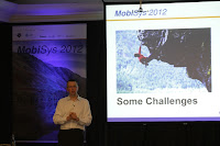
The opening keynote of MobiSys 2012 was presented by Dr. Paul Jones, the NHS Chief Technology Officer who talked about “Mobile Challenges in Health”. Health is very dear to people and the approach to health care around the world is very different.

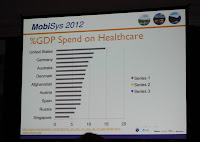
The NHS is a unique intuition that is providing healthcare to everyone in the UK. It is taxation funded and with its 110 billion pounds per year budget it is one of the cheaper (and yet efficient) health care systems in the world. The UK spends about 7% of its national cross product on health care, whereas the US or Germany nearly spend double of this percentage. Beside the economic size the NHS is also one of the biggest employers in the world, similar in size to the US department of defense and the Chinese people’s army. The major difference to other larger employers is, that a most part of the staff in the NHS is highly educated (e.g. doctors) and is not easily taking orders

Paul started out with the statement: technology is critical to providing health care in the future. Doing healthcare as it is currently done will not work in the future. Carrying on will not work as the cost would not be payable by society. In general information technology in the health sector is helping to create more efficient systems. He had some examples that often very simple system help to make a difference. In one case he explained that changing a hospitals scheduling practice from paper based diaries to a computer based systems reduced waiting times massively (from several month to weeks, without additional personal). In another case laptops were provided to community nurses. This saved 6 hours per week and freed nearly an extra day of work per week as it reduced their need for travelling back to the office. Paul argued, that this is only a starting point and not the best we can do. Mobile computing has the potential to create better solutions than a laptop that are more fitting the real working environment of the users and patients. One further example he used is dealing with vital signs of a patient. Traditionally this is measured and when degrading a nurse is calling a junior doctor and they have to respond in a certain time. In reality nurses have to ask more often and doctors may be delayed. In this case they introduced a system and mobile device to page/call the doctors and document the call (instead of nurses calling the doctors). It improved the response times of doctors – and the main reason is that actions are tracked and performance is measured (and in the medical field nobody wants to be the worst).

Paul shared a set of challenges and problems with the audience – in the hope that researchers take inspiration and solve some of the problems 😉

One major challenge is the fragmented nature of the way health care is provided. Each hospital has established processes and doctors have a way they want do certain procedures. These processes are different from each other – not a lot in many cases but different enough that the same software is not going to work. It is not each to streamline this, as doctors usually know best and many of them make a case why their solution is the only one that does the job properly. Hence general solutions are unlikely to work and solutions need to be customizable to specific needs.

Another interesting point was about records and paper. Paul argued that the amount of paper records in hospital is massive and they are less reliable and save as many think. It is common that a significant portion of the paper documentation is lost or misplaced. Here a digital solution (even if non-perfect) is most certainly better. From our own experience I agree on the observation, but I would think it is really hard to convince people about it.

The common element through the talk was, that it is key to create systems that fit the requirements. To achieve this it seems that having multidisciplinary teams that understand the user and patient needs is inevitable. Paul’s examples were based on his experience of seeing the user users and patient in context. He made firsthand the observation, that real world environments often do not permit the use of certain technologies or create sup-optimal solution. It is crucial that the needs to are understood by the people who design and implement the systems. It may be useful to go beyond the multidisciplinary team and make each developer spending one day in the environment they design for.

Some further problems he discussed are:

  • How to move the data around to the places where it is needed? Patients are transferred (e.g. ambulance to ER, ER to surgeons, etc.) and hence data needs to be handed over. This handover has to work across time (from one visit to the next) and across departments and institutions
  • Personal mobile devices (“bring your own device”) are a major issue. It seems easy for an individual to use them (e.g. a personal tablet to make notes) but on a system-level they create huge problems, from back-up to security. In the medical field another issue arises: the validity of data is guaranteed and hence the data gathered is not useful in the overall process.

A final and very interesting point was: if you are not seriously ill, being in a hospital is a bad idea. Paul argued, that the care you get at home or in the community is likely to be better and you are less likely to be exposed to additional risks. From this the main challenge for the MobiSys community arises: It will be crucial to provide mobile and distributed information systems that work in the context of home care and within the community.

PS: I like one of the side comments: Can we imagine doing a double blind study on a jumbo jet safety? This argument hinted, that some of the approaches to research in the medical field are not always most efficient to prove the validity of an approach.

Keynote at the Pervasive Displays Symposium: Kenton O’Hara

Kenton O’Hara, a senior researcher in the Socio-Digital-Systems group at Microsoft Research in Cambridge, presented the keynote at the pervasive displays symposium in Porto on the topic “Social context and interaction proxemics in pervasive displays“. He highlighted the importance of the spatial relationship between the users and the interactive displays and the different opportunities for interaction that are available when looking at the interaction context.

Using examples from the medical field (operating theater) he showed the issues that arise from the need of sterile interaction and hence avoiding touch interaction and moving towards a touchless interaction mode. A prototype, that uses a Microsoft Kinect sensor,  allows the surgeon to interact with information (e.g. an x-ray image) while working on the patient. It was interesting to see that gestural interaction in this context is not straightforward, as surgeons use tools (and hence have their hands not free) or gesture as a part of the communication in the team.

Another example is a public space game; there are many balls on a screen and a camera looking at the audience. Users can move the balls by body movement based on a simple edge detection video tracking mechanism and when two balls touch they form a bigger ball.  Kenten argues that “body-based interaction becomes a public spectacle” and interactions of an individum are clearly visible to others. This visibilility can lead to inhibition and may reduce the motivation of user to interact. For the success of this game the designing of the simplistic tracking algorithms is one major factor. By tracking edges/blobs the users can play together (e.g. holding hands, parents with the kids in their arm) and hence a wide range of interaction proxemics are supported. He presented some further examples of public display games on BBC large screens, also showing that the concept of interaction proxemics can be use to explain interaction .

TVs have change eating behavoir. More recent research in displays in the context of food consumptions have been in contrast mainly pragmatic (corrective, problem solving). Kenton argued that we look at the cultural values of meals and see shared eating as a social practice. Using the example of eating in front of the television (even as a family) he discusses the implications on communication and interaction (basically the communication is not happening). Looking at more recent technologies such as phones, laptops and tablets and their impact on social dynamics probably many of us realized that this is impacting many of us in our daily lives already (or who is not taking their phone to table?). It is very obvious that social relationships and culture changes with these technologies. He showed “4Photos” [1] a designed piece of technology to be put on the center of the table showing 4 photographs. Users can interact with it from all sides. It is designed in a way to stimulate rather than inhibit communication and to provide opportunities for conversation. It introduces interaction with technologies as a social gesture.

Interested in more? Kenton published a book on public displays in 2003 [2] and has a set of relevant publications in the space of the symposium.

References

[1] Martijn ten Bhömer, John Helmes, Kenton O’Hara, and Elise van den Hoven. 2010. 4Photos: a collaborative photo sharing experience. In Proceedings of the 6th Nordic Conference on Human-Computer Interaction: Extending Boundaries (NordiCHI ’10). ACM, New York, NY, USA, 52-61. DOI=10.1145/1868914.1868925 http://doi.acm.org/10.1145/1868914.1868925

[2] Kenton O’Hara, Mark Perry, Elizabeth Churchill, Dan Russell. Public and Situated Displays: Social and Interactional Aspects of Shared Display Technologies. Kluwer Academic, 2003

Media art, VIS Excursion to ZKM in Karlsruhe

This afternoon we (over 40 people from VIS and VISUS at the University of Stuttgart) went to Karlsruhe to visit the ZKM. We got guided tours to the panorama laboratory, the historic video laboratory, to the SoundARt exhibition and some parts of the regular exhibition. Additionally Prof. Gunzenhäuser gave a short introduction to the Zuse Z22 that is in on show there, too.

 The ZKM is a leading center for digital and media art that includes a museum for media art and modern art, several research institutes, and an art and design school. The approach is to bring media artists, works of art, research in media art and teaching in this field close together (within a single large building). The exhibitions include major media art works from the last 40 years.

The panorama laboratory is a 360 degree (minus a door) projection. Even though the resolution of the powerwall at VISUS [1] is higher and the presentation is in 3D, the360 degree 10 Megapixel panorama screen results in an exciting immersion. Without 3D, being surrounded by media creates a feeling of being in the middle of something that happens around you. Vivien described the sensation of movement similar to sitting in a train. The moment another train pulls out of the station you have a hard time to tell who is moving. I think such immersive environment could become very common once we will have digital display wallpaper.

The historic video laboratory is concerned with “rescuing” old artistic video material. We sometimes complain about the variety of video codecs, but looking at the many different formats for tapes and cassettes, this problem has a long tradition. Looking at historic split screen videos that were created using analog technologies one appreciates the virtues of digital video editing… Two are two amazing films by Zbigniew Rybczyński: Nowa Książka (New Book): http://www.youtube.com/watch?v=46Kt0HmXfr4 and and Tango: http://vodpod.com/watch/3791700-zbigniew-rybczynski-tango-1983

The current SoundArt exhibition is worthwhile. There are several indoor and outdoor installations on sounds. In the yard there is a monument built of speakers (in analogy to the oracle of Delphi) that you can call from anywhere (+49 721 81001818) and get 3 minutes of time to talk to whom even is in the vicinity of the installation. Another exhibit sonfied electron magnetic fields from different environments in an installation called the cloud.

[1] Powerwall at VISUS at the Univeristy of Stuttgart (6m by 2.20, 88 million pixel in, 44 million pixel per eye for 3D). http://www.visus.uni-stuttgart.de/institut/visualisierungslabor/technischer-aufbau.html.

Golden Doctorate – 50 years since Prof. Gunzenhäuser completed his PhD

It is 50 years now that Prof. Rul Gunzenhäuser, my predecessor on human computer interaction and interactive systems at the University of Stuttgart, defended his PhD. Some month back I came across his PhD thesis “Ästhetisches Maß und ästhetische Information“ (aesthetic measure and aesthetic information) [1], supervised by Prof. Max Bense, and I was seriously impressed.

He is one of the few truly interdisciplinary people I know. And in contrast to modern interpretations of interdisciplinary (people from different working together) he is himself interdisciplinary in his own education and work. He studied Math, Physics and Philosophy, worked while he studied in a company making (radio) tubes, completed a teacher training, did his PhD in Philosophy but thematically very close to the then emerging field of computer science and became later a post-doc in the computing center. He taught didactic of mathematics in a teacher training University, was a visiting professor at the State University of New York and finally became in 1973 professor for computer science at the University of Stuttgart staring the department of dialog systems. This unique educational path shaped his research and I would expect his whole person. Seeing this career path I have even more trouble accepting the streamlining of our educational system and find it easier to relate to a renaissance educational ideal.

Yesterday evening we had a small seminar and gathering to mark the 50th anniversary of his PhD. Our colleague Prof. Catrin Misselhorn, a successor on the chair of philosophy held by Max Bense, talked about “Aesthetic as Science?” (with a question mark) and started with the statement that what people did in this area 50 years ago is completely dated, if not largely wrong. I found the analysis very interesting and enlightening as it highlights that scientific results, to be relevant, do not have a non-transient nature. For a mathematician this may be hard to grasp, but for someone in computing and especially in human computer interaction this is a relief. It shows that scientific endeavors have to be relevant in their time but the lasting value may be specifically in the fact, that they go a single step forward. Looking back a human computer interaction a lot of the research in 70ties, 80ties, and 90ties looks now really dated, but we should not be fouled, without this work we would not be in interactive systems where we are now, if this work would not have been done.


Prof. Frieder Nake, one of the pioneers of generative art and a friend and colleague of Prof. Gunzenhäuser, reflected on the early work of computers and aesthetics and on computer generated art. He too argued the original approach is ‚dead‘, but the spirit of computer generated art is stronger now than ever, with many new tools available. He described early and heated discussions between philosophers, artists, and people who made computer generated art. One interesting approach to solve the dispute is is that the computer generated art is “artificial art” (künstliche Kunst).

The short take away message from the event is:
If you do research in HCI, do something that is fundamentally new. Question the existing approach and creates new ideas and concepts. Don’t worry if this will last forever, accept that your research will likely be ‚only‘ one step along the way. It has to be relevant when it is done, it matters less that it may have little relevance some 20 or 50 years later.

[1] Rul Gunzenhäuser. Ästhetisches Maß und ästhetische Information. 1962.

Share your digital activities on Android – AppTicker

If you share an apartment with a friend you know what they do. There is no need to communicate “I am watching TV” or “I am cooking” as this is pretty obvious. In the digital space this is much more difficulty. Sharing what we engage with and peripherally perceive what others do is not yet trivial.

Niels Henze and Alireza Sahami in our group have made a new attempt to research how to bridge this gap. With the AppTicker for Android they have released a software, that offers means to share usage of applications on your phone with your friends on Facebook. You can choose that whenever you start a certain app (e.g. the web browser, the camera, or the public transport app) this is shared in your activities on Facebook. In the middle screen you can see the means for control.

The app provides additionally a personal log (left screen) of all the apps that were used. I found that feature quite interesting and when looking at it I really started to reflect on my app usage patterns. If you are curious, have an android phone and if you use Facebook, please have a go and try it out.

The App homepage on our server: http://projects.hcilab.org/appticker/
Get it directly from Google Play or search for AppTicker in Google Play.

To access it directly you can scan the following QR-Code:

Book launch: Grounded Innovation by Lars Eric Holmquist

At the Museum of the Weird in Austin Lars Erik Holmquist hosted a book launch party for his book: Grounded Innovation: Strategies for Creating Digital Products. The book uses a good number of research examples to highlight the challenges and approaches for digital products. The book has to parts: Methods and Materials and shows how both play together in the design of digital products. There is a preview for the book at Amazon.

Over 10 years back I worked together with Lars Erik on the European Project Smart-Its (http://www.smart-its.org/), where we created sensor augmented artifacts. The book features also some of this work. To get an overview of the project have a look at [1] and [2]. The concept of Smart-Its Friends is presented in [3]. Smart-Its friends proposed the idea, that products can be linked by sharing the same context (e.g. connecting a phones and a wallet by shaking them together).

[1] Lars Erik Holmquist, Hans-Werner Gellersen, Gerd Kortuem, Albrecht Schmidt, Martin Strohbach, Stavros Antifakos, Florian Michahelles, Bernt Schiele, Michael Beigl, and Ramia Maze;. 2004. Building Intelligent Environments with Smart-Its. IEEE Comput. Graph. Appl. 24, 1 (January 2004), 56-64. (PDF) DOI=10.1109/MCG.2004.1255810 http://dx.doi.org/10.1109/MCG.2004.1255810

[2] Hans Gellersen, Gerd Kortuem, Albrecht Schmidt, and Michael Beigl. 2004. Physical Prototyping with Smart-Its. IEEE Pervasive Computing 3, 3 (July 2004), 74-82. (PDF) DOI=10.1109/MPRV.2004.1321032 http://dx.doi.org/10.1109/MPRV.2004.1321032

[3] Lars Erik Holmquist, Friedemann Mattern, Bernt Schiele, Petteri Alahuhta, Michael Beigl, and Hans-Werner Gellersen. 2001. Smart-Its Friends: A Technique for Users to Easily Establish Connections between Smart Artefacts. In Proceedings of the 3rd international conference on Ubiquitous Computing (UbiComp ’01), Gregory D. Abowd, Barry Brumitt, and Steven A. Shafer (Eds.). Springer-Verlag, London, UK, UK, 116-122. (PDF)

CHI2012 opening Keynote by Margaret Gould Stewart – Empowerment, Disruption, Magic

Margaret Gould Stewart, a highly regarded user experience designer currently leading UX design at YouTube, presented the opening keynote at CHI2012.  She started her talk with reminding us that humans are story tellers – they always have been and probably always will. What is not constant is the medium – as technologies change so do means for storytelling and sharing.

The topic started out with talking about video connects the world. It extended to a larger view – changing the world through experience design (in the context of video). I often wonder what designers are and she added another quite interesting explanation: designers are humanist. By putting up the definition for humanism she made her point clear that this could apply to good people in design, essentially it is down to caring for humans in their works.

To show the power of video in connecting people she used the following example: the film “Life in a Day” and as it said in the credits “a movie filmed by you”. I have not seen it yet, but the trailer made me curious to look at this one (see the film on YouTube).

By asking the question: what are the things that make sites like YouTube have impact? she introduced 3 principles. Sites have to be:

  • Empowering
  • Disruptive
  • Magical

She outlined what these 3 principles mean for user experience design.

For empowering she had very strong examples: how photo sharing, video sharing, and social networks changed what we see of natural disaster and the effect on people. It also changed way we see it and how we can respond to it. The concrete example was the information coverage on the Hurricane Katrina 2005 (pre-video-sharing age) and the recent flood in Asia. Empowering = helping people to share their stories.

Disruption is in this context the change in use of media and especially how it changes how we perceive the ubiquitous technology of TV. The capabilities of video sharing platforms has, are very different than those of TV – at the same time it is disrupting TV massively. She had a further example of how such technology can disrupt: The Khan Academy (basically sharing educational videos) is challenging the education system. As a further step she had an example where a teacher encourages students to make their own instructional videos as means for them to learn. Disruption = finding new ways that are challenging / overthrowing the old approach.

Magic is what makes technology exciting. There is a quote by Arthur C. Clarke “Any sufficiently advanced technology is indistinguishable from magic”. The term “magic” has a long tradition in human computer interaction. Alan Kay talked about it with regard to graphical user interfaces. We had some years back a paper  a paper on Magic beyond the screen [1]. In the talk Margaret Gould Stewart used as another example Instagram, as software that provides magical capabilities for the person using it. Another example of magic she discussed is the GPS based “moving dot” on a map that makes navigation in mobile maps easy. Even without navigational skills people can “magically” find their way. Her advice is “do not get in the way of magic” – focus on the experience not technology in the back ground. In short she summarized:  “Magic disrupts the notion of reality”.

She combined the principles in one example in the design of YouTube. She discussed the page design using an analogy to a plate.  A great plate makes all food presented on it look more attractive and the design goal of the YouTube page is to be such a plate for video. It should make look all videos look better.

Another example used to highlight how to empower, disrupt, and create magic is the http://www.thejohnnycashproject.com/. Each participant can manipulate one frame of the video (within given limits) and the outcome of the whole video is amazing. Cannot be described, you have to watch it.

Related to the example above an interesting question comes up: How much control is required and what type of control is applied. Here one example is twitter, which limits how much you can write but it does not limit what you post (limiting the form but not the content). She made an interesting argument about control. If you believe that democracy works and is good you can assume that people in general will make the right decisions. One further indicator is, that positive things go viral much more often than negative things. One of the takeaway messages is to believe in people an empower them.

To sum up, there are three questions to be asked when designing an experience:

  • How to empower people?
  • How to disrupt
  • How to create magic?

A final and important point is that there are things that cannot be explained and she argued that we should value this.

[1]  Albrecht Schmidt, Dagmar Kern, Sara Streng, and Paul Holleis. 2008. Magic Beyond the Screen. IEEE MultiMedia 15, 4 (October 2008), 8-13. DOI=10.1109/MMUL.2008.93 http://dx.doi.org/10.1109/MMUL.2008.93