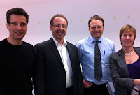
Book launch: Grounded Innovation by Lars Eric Holmquist

At the Museum of the Weird in Austin Lars Erik Holmquist hosted a book launch party for his book: Grounded Innovation: Strategies for Creating Digital Products. The book uses a good number of research examples to highlight the challenges and approaches for digital products. The book has to parts: Methods and Materials and shows how both play together in the design of digital products. There is a preview for the book at Amazon.

Over 10 years back I worked together with Lars Erik on the European Project Smart-Its (http://www.smart-its.org/), where we created sensor augmented artifacts. The book features also some of this work. To get an overview of the project have a look at [1] and [2]. The concept of Smart-Its Friends is presented in [3]. Smart-Its friends proposed the idea, that products can be linked by sharing the same context (e.g. connecting a phones and a wallet by shaking them together).

[1] Lars Erik Holmquist, Hans-Werner Gellersen, Gerd Kortuem, Albrecht Schmidt, Martin Strohbach, Stavros Antifakos, Florian Michahelles, Bernt Schiele, Michael Beigl, and Ramia Maze;. 2004. Building Intelligent Environments with Smart-Its. IEEE Comput. Graph. Appl. 24, 1 (January 2004), 56-64. (PDF) DOI=10.1109/MCG.2004.1255810 http://dx.doi.org/10.1109/MCG.2004.1255810

[2] Hans Gellersen, Gerd Kortuem, Albrecht Schmidt, and Michael Beigl. 2004. Physical Prototyping with Smart-Its. IEEE Pervasive Computing 3, 3 (July 2004), 74-82. (PDF) DOI=10.1109/MPRV.2004.1321032 http://dx.doi.org/10.1109/MPRV.2004.1321032

[3] Lars Erik Holmquist, Friedemann Mattern, Bernt Schiele, Petteri Alahuhta, Michael Beigl, and Hans-Werner Gellersen. 2001. Smart-Its Friends: A Technique for Users to Easily Establish Connections between Smart Artefacts. In Proceedings of the 3rd international conference on Ubiquitous Computing (UbiComp ’01), Gregory D. Abowd, Barry Brumitt, and Steven A. Shafer (Eds.). Springer-Verlag, London, UK, UK, 116-122. (PDF)

CHI2012 opening Keynote by Margaret Gould Stewart – Empowerment, Disruption, Magic

Margaret Gould Stewart, a highly regarded user experience designer currently leading UX design at YouTube, presented the opening keynote at CHI2012.  She started her talk with reminding us that humans are story tellers – they always have been and probably always will. What is not constant is the medium – as technologies change so do means for storytelling and sharing.

The topic started out with talking about video connects the world. It extended to a larger view – changing the world through experience design (in the context of video). I often wonder what designers are and she added another quite interesting explanation: designers are humanist. By putting up the definition for humanism she made her point clear that this could apply to good people in design, essentially it is down to caring for humans in their works.

To show the power of video in connecting people she used the following example: the film “Life in a Day” and as it said in the credits “a movie filmed by you”. I have not seen it yet, but the trailer made me curious to look at this one (see the film on YouTube).

By asking the question: what are the things that make sites like YouTube have impact? she introduced 3 principles. Sites have to be:

  • Empowering
  • Disruptive
  • Magical

She outlined what these 3 principles mean for user experience design.

For empowering she had very strong examples: how photo sharing, video sharing, and social networks changed what we see of natural disaster and the effect on people. It also changed way we see it and how we can respond to it. The concrete example was the information coverage on the Hurricane Katrina 2005 (pre-video-sharing age) and the recent flood in Asia. Empowering = helping people to share their stories.

Disruption is in this context the change in use of media and especially how it changes how we perceive the ubiquitous technology of TV. The capabilities of video sharing platforms has, are very different than those of TV – at the same time it is disrupting TV massively. She had a further example of how such technology can disrupt: The Khan Academy (basically sharing educational videos) is challenging the education system. As a further step she had an example where a teacher encourages students to make their own instructional videos as means for them to learn. Disruption = finding new ways that are challenging / overthrowing the old approach.

Magic is what makes technology exciting. There is a quote by Arthur C. Clarke “Any sufficiently advanced technology is indistinguishable from magic”. The term “magic” has a long tradition in human computer interaction. Alan Kay talked about it with regard to graphical user interfaces. We had some years back a paper  a paper on Magic beyond the screen [1]. In the talk Margaret Gould Stewart used as another example Instagram, as software that provides magical capabilities for the person using it. Another example of magic she discussed is the GPS based “moving dot” on a map that makes navigation in mobile maps easy. Even without navigational skills people can “magically” find their way. Her advice is “do not get in the way of magic” – focus on the experience not technology in the back ground. In short she summarized:  “Magic disrupts the notion of reality”.

She combined the principles in one example in the design of YouTube. She discussed the page design using an analogy to a plate.  A great plate makes all food presented on it look more attractive and the design goal of the YouTube page is to be such a plate for video. It should make look all videos look better.

Another example used to highlight how to empower, disrupt, and create magic is the http://www.thejohnnycashproject.com/. Each participant can manipulate one frame of the video (within given limits) and the outcome of the whole video is amazing. Cannot be described, you have to watch it.

Related to the example above an interesting question comes up: How much control is required and what type of control is applied. Here one example is twitter, which limits how much you can write but it does not limit what you post (limiting the form but not the content). She made an interesting argument about control. If you believe that democracy works and is good you can assume that people in general will make the right decisions. One further indicator is, that positive things go viral much more often than negative things. One of the takeaway messages is to believe in people an empower them.

To sum up, there are three questions to be asked when designing an experience:

  • How to empower people?
  • How to disrupt
  • How to create magic?

A final and important point is that there are things that cannot be explained and she argued that we should value this.

[1]  Albrecht Schmidt, Dagmar Kern, Sara Streng, and Paul Holleis. 2008. Magic Beyond the Screen. IEEE MultiMedia 15, 4 (October 2008), 8-13. DOI=10.1109/MMUL.2008.93 http://dx.doi.org/10.1109/MMUL.2008.93

Keynote at Percom 2012: Andy Hopper from Cambridge on Computing for the Future of the Planet

In his Keynote „Computing for the Future of the Planet“ Andy Hopper brought up 4 topics and touched shortly on each of them: (1) Optimal digital infrastructure – green computing, (2) Sense and optimize – computing for green, (3) Predict and react – assured computing, and (4) Digital alternatives to physical activities.

In the beginning of his talk he discussed an interesting (and after he said it very obvious) option of Green Computing: move computing towards the energy source as it is easier to transmit data than to transmit power. Thinking about this I could imagine that Google’s server farms are move to a sunny dessert and then the calculations are done while the sun is shining… and using the cold of night to cool down… This could be extended to storage: storing data is easier than storing energy – this should open some opportunities.

As a sample of an embedded sensing systems Andy Hopper presented a shoe with built-in force sensing (FSR) that allows to measure contact time and this helps to work out speed. There initial research was targeted towards athletes, see Rob Harle’s page for details. It is however easy to imagine the potential this has if regular shoes can sense movement in everyday use. He hinted to think about the options if one could go to doctor and analyze the change in walking pattern over the last year.

In various examples Andy showed how Ubisense is used in commercial applications, production, and training. It seems that medium resolution tracking (e.g. below 1 meter accuracy) can be reliably achieved with such an off the shelf systems, even in harsh environments. He mentioned that the university installations of the system at an early product stage were helpful to improve the product and grow the company. This is interesting advices, and could be a strategy for other pervasive computing products, too. For close observers of the slides there were some interesting inside in the different production methods between BMW and Austin Martin and the required quality 😉

Power usage is a central topic in his labs work and he showed several examples of how to monitor power usage in different scenarios. On example is monitoring power usage on the phone, implemented as an App that looks at how power is consumed and how re-charging is done. This data is then collected and shared – at current over 8000 people are participating. For more details see Daniel T. Wagner’ page. A further example is the global personal energy meter. He envisions that infrastructure, e.g. trains and building, are broadcasting information about the use of energy and that they provide information about one individuals share of this.

With an increasing proliferation of mobile phones the users’ privacy becomes a major issue. He showed in his talk an example, where privacy is provided by faking data. In this approach fake data, e.g. for calendar events, location data, and address book, is provided to apps on the phone. By these means you can alter what an application sees (e.g. location accuracy).

For more details and papers see the website of the digital technology group: http://www.cl.cam.ac.uk/research/dtg/www/

Opening talk at the Social Media for Insurances Symposium

I was invited to Leipzig to talk about social networks and in the context of insurance companies (http://www.versicherungsforen.net/social-media). The main focus of the talk was to show what people currently do in social networks and to speculate why they do it (and  I used a picture of the seven deadly sins as an illustrations…) Additionally I discussed some prototypes of activity recognition and their potential once integrated into social media.

My talk was entitled “500 Freunde (auf Facebook): Wozu noch eine Versicherung?“ – „500 friends (on Facebook) – Is there still need for insurance?“ and discussed how ubiquitous capture and social media may shape the next community [1]. The slides in are in German.

The event was very interesting and I would expect that there is a great potential out there for insurance companies to tap into. Looking back at the original idea of insurance (e.g. old fire insurance communities) or sharing the risk of hail in farming communities can give interesting inspiration for peer-2-peer insurance models. It will be exciting to see if there a new products and services that come out of the “big players” or if new players will come to the game. To me the central issue to address is how to make insurance products more visible – and I think a user centered design approach could be very interesting…

In the future I would expect that finding the right value mix (privacy, price, safety, etc.) will be essential as we argued for other services in [2]. Some years back we wrote in an article about RFID [3] “privacy is sacred but cheap” and the more services we see the more I am convinced that this is more than a slogan. If you can create a service that is of immediate value to the user I would I expect that privacy will be a lesser concern to most? On the other hand if you reduce privacy without any value in exchange there is always an outcry…

[1] “500 Freunde (auf Facebook): Wozu noch eine Versicherung?“ – Ermöglichen allgegenwärtige Aufzeichnungs-technologien und digitale soziale Netze die nächste Solidargemeinschaft? Slides as PDF (in German)
[2] Albrecht Schmidt, Marc Langheinrich, Kristian Kersting, „Perception beyond the Here and Now,“ Computer, vol. 44, no. 2, pp. 86-88, Feb. 2011, doi:10.1109/MC.2011.54 (final version at IEEE, free draft version)
[3] Schmidt, A.; Spiekermann, S.; Gershman, A.; Michahelles, F., „Real-World Challenges of Pervasive Computing„, Pervasive Computing, IEEE , vol.5, no.3pp. 91- 93, c3, July-Sept. 2006. 10.1109/MPRV.2006.57

Facebook – a platform to spot when companies go bankrupt? Real world example.

In the Germany the drug store chain Schlecker announced to be insolvent, see the Reuter news post. If you look at the company’s Facebook page and scan the comments from the last 4 weeks it is apparent that some people in the crowd and employees expected it already last year.
Schlecker is a large drug store chain with probably over 10.000 outlets in Europe and more than 30.000 employees.

The following screen shots show some selected examples I took from the following page: http://www.facebook.com/schlecker.drogerie 
The posts are in German – the minimal summary should give you some idea…

This one the company wishes a happy Christmas and reminds people of a chance to win a car. The first replies echo the holiday greetings but then one complains that they let their shops bleed out (run empty) and that the order good do not arrive (probably posted by an employee). One further speculates that the company is close to bankruptcy. (over 3 weeks before the official note of insolvency)


The company announces a 2 euro discount on a product. Then employees post that they would like to sell the goods to the customers but that they do not get the goods for their shops. Additionally they complain that the goods they get from other closed down shows are not what they need. One says we want to work but we cat (as they are running out of stock). (over 2 weeks before the official note of insolvency)

The company announces price reductions in some goods. Some says that is great – but would be much better if these goods would be in the shops to buy them. (9 days before the official note of insolvency)

Overall I think this is an instructive real world example of the information that can be found in social networks about the health/value of companies. In particular the mix of customers and employees posting makes it a good example to study. I would expect that companies will learn lessons from this with regard to guidelines for the employees… and about transparency / openness…to understand how reliable such posts are we probably need to do some more research? let us know if you are interested in working this with us.

Congratulations to Frau Doktor Dagmar Kern for a great PhD defense (No. 5)

Dagmar Kern has successfully defended her PhD on “Supporting the Development Process of Multimodal and Natural Automotive User Interfaces” in Essen. External examiner was Antonio Krüger from University of Saarbrücken. Her dissertation will be available online soon. The core contribution of the thesis is the investigation of how to improve a user centered design process for automotive user interfaces. In order to systematically assess user interface designs in cars she developed a design space (inspired by Card et al [5]). In various cases studies she create novel in-car user interfaces and explored experimentally the implications on driver distraction.

Dagmar started working with me as a student of Media Informatics at the LMU Munich in 2005, then jointed my group at Fraunhofer IAIS/BIT in Bonn and move in 2007 with the group to Essen. She was for a short research stay in Saarbrücken and Milton Keynes and was extremely productive over the last years – 18 publications she co-authored are listed in DBLP and here are some highlights of here research:

  • exploration of how to present navigation information (e.g. vibra tactile steering wheel) [1]
  • gazemarks – an approach to aid attention switching between the road and an in car display using eye gaze date [2]
  • a multi-touch steering wheel, that reduced driver distraction [3]
  • a design space for automotive user interfaces [4]

Additionally to the publications one of the side products of here thesis is the CARS open source driving simulator. It is a configurable low cost simulator that can be used to measure driver distraction, e.g. as an alternative to LCT.

Dagmar’s defense brought us back to Essen and it was great to meet many colleagues again. We finally managed to have a group photo taken with nearly all the team (Elba is missing in the Photo).

The doctoral hat may look strange to non-Germans but it has some funny tradition. It is hand crafted by the colleagues and each of the items on the hat tells a story – usually known to the group but in the best case hard to guess for outsiders. Besides others Dagmar’s hat included a scrap heap of cars, a giraffe, a personal vibration device, a yoyo, a railway station building side, and a steering wheel cover.

[1] Dagmar Kern, Paul Marshall, Eva Hornecker, Yvonne Rogers, and Albrecht Schmidt. 2009. Enhancing Navigation Information with Tactile Output Embedded into the Steering Wheel. InProceedings of the 7th International Conference on Pervasive Computing (Pervasive ’09). Springer-Verlag, Berlin, Heidelberg, 42-58. DOI=10.1007/978-3-642-01516-8_5 (free PDF)

[2] Dagmar Kern, Paul Marshall, and Albrecht Schmidt. 2010. Gazemarks: gaze-based visual placeholders to ease attention switching. In Proceedings of the 28th international conference on Human factors in computing systems (CHI ’10). ACM, New York, NY, USA, 2093-2102. DOI=10.1145/1753326.1753646 (free PDF)

[3] Tanja Döring, Dagmar Kern, Paul Marshall, Max Pfeiffer, Johannes Schöning, Volker Gruhn, and Albrecht Schmidt. 2011. Gestural interaction on the steering wheel: reducing the visual demand. In Proceedings of the 2011 annual conference on Human factors in computing systems (CHI ’11). ACM, New York, NY, USA, 483-492. DOI=10.1145/1978942.1979010 (free PDF)

[4] Dagmar Kern and Albrecht Schmidt. 2009. Design space for driver-based automotive user interfaces. In Proceedings of the 1st International Conference on Automotive User Interfaces and Interactive Vehicular Applications (AutomotiveUI ’09). ACM, New York, NY, USA, 3-10. DOI=10.1145/1620509.1620511 (free PDF)

[5] Stuart K. Card, Jock D. Mackinlay, and George G. Robertson. 1991. A morphological analysis of the design space of input devices. ACM Trans. Inf. Syst. 9, 2 (April 1991), 99-122. DOI=10.1145/123078.128726

Doktorandenkolleg

Willkommen zum VIS(US) Doktorandenkolleg!

Das Institut für Visualisierung und Interaktive Systeme (VIS) lädt Doktorandinnen und Doktoranden zum wissenschaftlichen Austausch und zur Information über Perspektiven nach der Promotion in Wirtschaft und Wissenschaft im Rahmen des Doktorandenkollegs 2012 ein.

Wann? 06.-08. Februar 2012
Wo? Waldhotel Zollernblick, Freudenstadt
Wer? Doktorandinnen und Doktoranden des VIS(US)
Leitung: Tom Ertl, Martin Fuchs, Albrecht Schmidt, Daniel Weiskopf
Institut für Visualisierung und Interaktive Systeme (VIS)
Visualisierungsinstitut der Universität Stuttgart


Vorläufiges Programm 

Tag 1 –   6. Februar 2012
Skifahren bei genügend Schnee (=Urlaubstag 😉 )
Anreise nach Freudenstadt (Organisation nach Absprache)
18 Uhr Gemeinsames Abendessen
20 Uhr

20:30

Prof. Dr. Rul Gunzenhäuser:
Thesen und Prognosen aus dem Bereich der Informatik

Albrecht Schmidt: „die Welt in 100 Jahre“
– Rückblick auf ein Buch von Wissenschaftlern von 1910 –
Wir entwickeln von Szenarien für die nächsten 100 Jahre

Tag 2   7. Februar 2012
08:45 Einführung/Eröffnung
09:00 Vortrag: Andrés Bruhn
Vorstellung des Arbeitsgebiets und der neuen Arbeitsgruppe
10:00 „FastForward“ Poster – Session 1
Kurzpräsentation (Elevator-Talk) – 90 Sekunden (strikt!) pro Person
20 Präsentation thematisch bunt gemischt
Ziel: Dissertationsthema und Arbeitsgebiet allgemeinverständlich für Informatiker erklären und auf das eigene Poster neugierig machen
10:30 – 11:30 Kaffeepause, Posterausstellung und Gespräche an den Postern
11:30 – 12:30 Track A: Session 1
3 Vorträge @ 10 Minuten
Track B: Session 1
3 Vorträge @ 10 Minuten
Track C: Session 1
3 Vorträge @ 10 Minuten
12:30 – 14:00 Mittagessen
14:00 – 15:00 Track A: Session 2
3 Vorträge @ 10 Minuten
Track B: Session 2
3 Vorträge @ 10 Minuten
Track C: Session 2
3 Vorträge @ 10 Minuten
15:30 – 16:00 „FastForward“ Poster – Session 2
Kurzpräsentation (Elevator-Talk) – 90 Sekunden (strikt!) pro Person
20 Präsentation thematisch bunt gemischt
Ziel: Dissertationsthema und Arbeitsgebiet allgemeinverständlich für Informatiker erklären und auf das eigene Poster neugierig machen
16:00 – 17:00 Kaffeepause, Posterausstellung und Gespräche an den Postern
17:00 – 18:00 Frei 🙂
18 Uhr Gemeinsames Abendessen
20 Uhr Informatik Studieren – Was macht es attraktiv?
Wie sollten wir unsere Studiengänge gestalten?
Wie gewinnen wir die besten Studierenden?
Diskussion und Gruppenarbeit
Tag 3   8. Februar 2012
08:30 – 10:30 Karrierewege nach der Promotion

  • Profile und Anforderungen
  • Akademische Karriere im Ausland (z.B. USA, UK)
  • Consulting
  • Entwickler (z.B. Google)
  • Management
  • Professor an einer (Fach)-Hochschule
  • Professor an einer Uni
  • Unternehmensgründung
  • Wissenschaftler in einem Forschungslabor

Diskussion ?

10:30 – 11:00 Kaffeepause
11:00 – 12:00 Track A: Session 3
2 Vorträge @ 10 Minuten
Diskussion
Publikationsstrategie
Track B: Session 3
2 Vorträge @ 10 Minuten
Diskussion
Publikationsstrategie
Track C: Session 3
2 Vorträge @ 10 Minuten
Diskussion
Publikationsstrategie
12:00 Mittagessen
Abreise, Rückfahrt nach Stuttgart
Evtl. Skifahren (bei Schnee und Interesse…)

Einreichung von Beiträgen

Ab sofort: Anmeldung per E-Mail an anja.mebus@vis.uni-stuttgart.de (Betreff: „DOKO-2012“, bitte Anschrift, Arbeitstitel des Promotionsvorhabens und Betreuerin oder Betreuer der Promotion angeben)
bis 24.1.2012: Einreichung einer Kurzfassung des Beitrags zum Doktorandenkolleg
(max. 1 Seite, unter Beachtung der folgenden Hinweise)
Hinweis: Für die Teilnahme am Doktorandenkolleg stehen nur begrenzt Plätze zur Verfügung. Sollte die Zahl der Anmeldungen die verfügbaren Kapazitäten überschreiten, entscheiden die Organisatoren über die Annahme von Beiträgen!
bis 2.2.2012: Feedback
bis 5.2.2012: Abgabe der finalen Version des Beitrags

Anmeldung von Beiträgen

Mit dem Doktoranden-Kolloquium möchten wir alle die in VIS und VISUS promovieren motivieren über Ihr Dissertationsthema zu berichten und zu diskutieren. Jede(r) Teilnehmer(in) soll bis zu, 24.1.2012 einen Beitrag im Umfang von ca. 1 Seite (Vorlagen siehe unten) schreiben, der die folgenden Abschnitte enthält:

Problembeschreibung und Forschungsfrage

  • Welches Problem wollt ihr mit euerer Forschung lösen?
  • Warum ist es wichtig dieses Problem zu lösen?
  • Aus welchem Grund sollte jemand für Forschung an dieser Frage bezahlen?
  • Was ist die zentrale Forschungsfrage und was wollt ihr sie konkret herausfinden?
  • Was ist der zu erwartende Wissensgewinn?

Vorgehensweise und Methode

  • Wie führt ihr eure Forschung durch? Ist eure Forschung theoretisch, experimentell oder empirisch?
  • Wie verifizieren oder evaluieren ihr die Ergebnisse?
  • Wie stellt ihr die Richtigkeit und Qualität eurer Ergebnisse sicher?
  • Erkläre kurz die Vorgehensweise und begründe warum diese für deine Forschungsarbeiten angemessen ist. Welche alternativen Vorgehensweisen wären möglich und warum verwendest du diese nicht?
  • Welche Methoden setzt du ein?

Verwandte Arbeiten

  • Was sind die wichtigsten drei Arbeiten anderer Forschungsgruppen auf die sich deine Forschung bezieht?
  • Wie haben diese Arbeiten dich beeinflusst?
  • Was machst du besser als die bisherigen Arbeiten? Wo ergibt sich etwas Neues durch deine Arbeit?

Vorläufige Ergebnisse

  • Was hast du bis jetzt herausgefunden? Beschreibe die vorläufigen Ergebnisse.
  • Aus welchem Grund sollten wir diesen Ergebnissen vertrauen? Wie hast du diese überprüft?
  • Welche weiteren Ergebnisse erwartest du?

Nächste Schritte

  • Was sind die nächsten Schritte in deiner Arbeit? Was fehlt noch damit aus der Arbeit eine Dissertation wird?
  • Wo brauchst du noch weitere (externe) Expertise? An welchen Stellen wären Kooperationen hilfreich?

Formatvorlage und Einreichung
Bitte verwendet die folgende Vorlage für die Einreichung. Bitte schickt den Beitrag als PDF an anja.mebus@vis.uni-stuttgart.de (Betreff: „DOKO-2012-Beitrag“)

Beispiel: PDF
Latex-Vorlage: ZIP-Archiv
MS-Word 97-2003 Vorlage: DOC
MS-Word 2007 Vorlage: DOCX

Auto-UI 2012 in the US, looking for hosts for 2013

The next and 4rd international conference on Automotive User Interfaces and Vehicular Applications (AutoUI 2012) will be in Portsmouth, New Hampshire in the USA. The dates for the conference are 17-19 of October 2012. The first day for workshops and tutorials and 2 days for the main conference. Portsmouth is about an 1 hour drive from Boston and the timing is great (fall foliage – the photos of the colorful forests looked good 😉

The steering committee (sc@auto-ui.org) is inviting proposals for Auto-UI 2013 from the community of researchers in the field. The conference was 2009 in Essen (Germany), 2010 in Pittsburgh (USA), 2011 in Salzburg (Austria), and it will be in 2012 in Portsmouth (USA). Keeping this cycle between Europe and North America 2013 should be in Europe.

Paper and demo in Salzburg at Auto-UI-2011

At the automotive user interface conference in Salzburg we presented some of our research. Salzburg is a really nice place and Manfred and his team did a great job organizing the conference!

Based on the Bachelor Thesis of Stefan Schneegaß and some follow-up work we published a full paper [1] that describes a KLM-Model for the car and a prototyping tools that makes use of the model. In the model we look at the specific needs in the car, model rotary controllers, and cater for the limited attention while driving. The prototyping tool provides means to quickly estimate interaction times. It supports visual prototyping using images of the UI and tangible prototyping using Nic Villar´s VoodooIO. Looking forward to having Stefan on our team full-time 🙂

We additionally had a demo on a recently completed thesis by Michael Kienast. Here we looked at how speech and gestures can be combined for controlling functions, such as mirror adjustments or windscreen wipers, in the car. This multimodal approach combines the strength of gestural interaction and speech interaction [2].

The evening event of the conference was at Festung Hohensalzburg – with a magnificent view over the twon!

[1] Stefan Schneegaß, Bastian Pfleging, Dagmar Kern, Albrecht Schmidt. Support for modeling interaction with in-vehicle interfaces. (PDF) Proceedings of 3rd international conference on Automotive User Interfaces and Vehicular Applications 2011 (http://auto-ui.org). Salzburg. 30.11-2.12.2011

[2] Bastian Pfleging, Michael Kienast, Albrecht Schmidt. DEMO: A Multimodal Interaction Style Combining Speech and Touch Interaction in Automotive Environments. Adjunct proceedings of 3rd international conference on Automotive User Interfaces and Vehicular Applications 2011 (http://auto-ui.org). Salzburg. 30.11-2.12.2011

Bryan Reimer: Opening keynote at Auto-UI 2011 in Salzburg

Bryan started his keynote talk the automotive user interface conference (auto-ui.org) in Salzburg with reminding us that having controversial discussions about the HMI in the car is not new. Quoting a newspaper article from the 1930s on the introduction of the radio in the car and its impact on the driver he picked an interesting example, that can be seen as the root of many issues we have now with infotainment systems in the car.

The central question he raised is: how to create user interface that fit human users? He made an important point: humans are not “designed” to drive at high speed in complex environments; perception has evolved for walking and running in natural environment. Additionally to the basic limitations of human cognition, there is a great variety of capabilities of drivers, their skills and cognitive ability (e.g. influence of age). A implication of the global change is demographics is that the average capabilities of a drivers will be reduced – basically as many older people will be drivers…

Over the last 100 years cars have changes significantly! Looking more closely Bryan argues that much of the chance happened in the last 10 years. There has been little change from the 1950s to the 1990s with regard to the car user interface.

It is apparent that secondary tasks are becoming more important to the user. Users will interact more while driving because the can. It is however not obvious that they are capable of it.

Even given these developments it is apparent that driving has become safer. Passive safety has been improved massively and this made driving much safer. There seems to be a drawback to this as well, as people may take greater risks as they feel safer. The next step is really to avoid accidence in the first place. Bryan argues that the interaction between driver, environment, and vehicles is very important in that. He suggests that we should make more of an effort to create systems that fit the drivers.

The Yerkes-Dodson Law helps to understand how to design systems that keep peoples attention in the optimal performance. He made an important point: there are certain issues that cannot be solved, e.g. if someone is tired we can do only very little – the driver will need to rest. We should make sure that we take these things into account when designing systems.

Visual distraction is an obvious factor and much discussed in the papers at the conference – but Bryan argued that “eyes on the road” is not equal to “mind on the road”. I think this is really a very important point. Ensuring that people keep their eyes on the road, seeing things is not enough. The big resulting question is how to keep or get people focused on the street and environment. It seems there is some more research to do…

The variety of interfaces and interaction metaphors build into cars opens more choices but at the same time creates problems, as people need to learn and understand them. A simple question such as: How do you switch the car off? may be hard to answer (Bryan had the example of a car with a push button starter, where you cannot remove the key). I think there are simple questions that can be learned from industry and production machines… add an emergency stop button and make it mandatory 😉

If you are interested more about Bryan’s work look at his webpage or his page at the MIT agelab or one of his recent publications [1] in the IEEE Pervasive Computing Magazine’s special issue on automotive computing, see [2] for an introduction to the special issue.

Sorry for the poor quality photos … back row and an iPhone…

[1] Joseph F. Coughlin, Bryan Reimer, and Bruce Mehler. 2011. Monitoring, Managing, and Motivating Driver Safety and Well-Being. IEEE Pervasive Computing 10, 3 (July 2011), 14-21. DOI=10.1109/MPRV.2011.54 http://dx.doi.org/10.1109/MPRV.2011.54

[2] Albrecht Schmidt, Joseph Paradiso, and Brian Noble. 2011. Automotive Pervasive Computing. IEEE Pervasive Computing 10, 3 (July 2011), 12-13. DOI=10.1109/MPRV.2011.45 http://dx.doi.org/10.1109/MPRV.2011.45