 People take mobile devices into their cars and the amount of information people have on those devices is huge – just consider the number of songs on an MP3-Player, the address database in a navigation system and eventually the mobile web. In our work we looked at ways to design and implement search interfaces that are usable while driving [1]. For the paper we compared a categorized search and a free search. The was another paper in the session looking at practice of GPS use by Leshed et al. which was really interesting and can inform future navigation or context-aware information systems [2].
  One interesting finding is that you loose AND at the same time create opportunities for applications and practices. In the questions she hinted some interesting observations on driving in familiar vs. driving in unfamiliar environments using GPS units. Based on these ideas there may be an interesting student project to do…
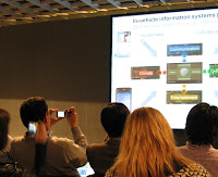
 The interest in Wolfgang’s talk and into automotive user interfaces in general was unexpected high. As you see on the picture there was quite a set of people talking pictures and videos during the presentation.
[1] Graf, S., Spiessl, W., Schmidt, A., Winter, A., and Rigoll, G. 2008. In-car interaction using search-based user interfaces. In Proceeding of the Twenty-Sixth Annual SIGCHI Conference on Human Factors in Computing Systems (Florence, Italy, April 05 – 10, 2008). CHI ’08. ACM, New York, NY, 1685-1688. DOI= http://doi.acm.org/10.1145/1357054.1357317
[2] Leshed, G., Velden, T., Rieger, O., Kot, B., and Sengers, P. 2008. In-car gps navigation: engagement with and disengagement from the environment. In Proceeding of the Twenty-Sixth Annual SIGCHI Conference on Human Factors in Computing Systems (Florence, Italy, April 05 – 10, 2008). CHI ’08. ACM, New York, NY, 1675-1684. DOI= http://doi.acm.org/10.1145/1357054.1357316
 Yesterday night I flew to
  In the meeting we discussed a large number of submission made to Mensch und Computer 2008. It seems there are quite an interesting number of papers in the program which make the conference worth while. We will also run the second edition of our workshop on Automotive User Interface and Interactive Applications. The automotive workshop we ran 2007 in

