The computer mouse – next generation?

In my lecture on user interface engineering I start out with a short history of human computer interaction. I like to discuss ideas and inventions in the context of the people who did it, besides others I take about Vannevar Bush and his vision of information processing [1], Ivan Sutherland’s sketchpad [2], Doug Engelbart’s CSCW demo (including the mouse) [3], and Alan Kay’s vision of the Dynabook [4].

One aspect of looking at the history is to better understand the future of interaction with computers. One typical question I ask in class is „what is the ultimate user interface“ and typical answers are „direct interface to my brain – the computer will do what I think“ and „mouse and keyboard“ – both answers showing some insight…

As the mouse is still a very import input device (and probably for some time to come) there is a recent paper that I find really interesting. It looks at how the mouse could be enhanced – Nicolas Villar and his colleagues put really a lot of ideas together [5]. The paper is worthwhile to read – but if you don’t have time at least watch it on youtube.

[1] Vannevar Bush, As we may think, Atlantic monthly, July 1945.
[2] Ivan Sutherland, „Sketchpad: A Man-Machine Graphical Communication System“ Technical Report No. 296, Lincoln Laboratory, Massachusetts Institute of Technology via Defense Technical Information Center January 1963. (PDF, youtube).
[3] Douglas Engelbart, the demo 1968. (Overview, youtube)
[4] John Lees. The World In Your Own Notebook (Alan Kay’s Dynabook project at Xerox PARC). The Best of Creative Computing. Volume 3 (1980)
[5] Villar, N., Izadi, S., Rosenfeld, D., Benko, H., Helmes, J., Westhues, J., Hodges, S., Ofek, E., Butler, A., Cao, X., and Chen, B. 2009. Mouse 2.0: multi-touch meets the mouse. In Proceedings of the 22nd Annual ACM Symposium on User interface Software and Technology (Victoria, BC, Canada, October 04 – 07, 2009). UIST ’09. ACM, New York, NY, 33-42. DOI= http://doi.acm.org/10.1145/1622176.1622184

Reto Wetach visits our lab… and looking for someone with expertise in pain

Reto Wettach was in Essen so we took the opportunity to get together to flash out some ideas for a proposal – it is related to pain – in a positive sense. There is interesting and scary previous work, see [1] & [2]. For the proposal we still look for someone not from the UK and not from Germany – who has an expertise and interest in medical devices (sensors and actuators) and someone who has experience in pain and perception of pain (e.g. from the medical domain). Please let me know if you know someone who may fit the profile …

Before really getting to this we had a good discussion on the usefulness of the concept of tangible interaction – obviously we see the advantages clearly – but nevertheless it seem in many ways hard to proof. The argument for tangible UIs as manipulators and controls is very clear and can be shown but looking at tangible objects as carriers for data it becomes more difficult. Looking a physical money the tangible features are clear and one can argue for the benefit of tangible qualities (e.g. I like Reto’s statement „the current crisis would not have happened if people would have had to move money physically“) – but also the limitations are there and modern world with only tangible money would be unimaginable.

Taking the example of money (coins and bills) two requirements for tangible objects that embody information become clear:

  • The semantic of the information carried by the object has to be universally accepted
  • Means for processing (e.g. reading) the tangible objects have to be ubiquitously available

There is an interesting and early paper that looks into transporting information in physical form [3]. The idea is simple: data can be assigned to/associated with any object and can be retrieved from this object. The implementation is interesting, too – the passage mechanism uses the weight of an object as ID.

[1] http://www.painstation.de/
[2] Dermot McGrath. No Pain, No Game. Wired Magazin 07/2002.
[3] Shin’ichi Konomi, Christian Müller-Tomfelde, Norbert A. Streitz: Passage: Physical Transportation of Digital Information in Cooperative Buildings. Cooperative Buildings. Integrating Information, Organizations and Architecture. CoBuild 1999. Springer LNCS 1670. pp. 45-54.

Impact of colors – hints for ambient design?

There is a study that looked at how the performace in solving certain cognitive/creative tasks is influenced by the backgroun color [1]. In short: to make people alert and to increase performance on detail oriented tasks use red; to get people in creative mode use blue. Lucky us our corporate desktop background is mainly blue! Perhaps this could be interesting for ambient colors, e.g. in the automotive context…

[1] Mehta, Ravi and Rui (Juliet) Zhu (2009), „Blue or Red? Exploring the Effect of Color on Cognitive Task Performances“ Science 27 February 2009:Vol. 323. no. 5918, pp. 1226 – 1229 DOI: 10.1126/science.1169144

Modular device – for prototyping only?


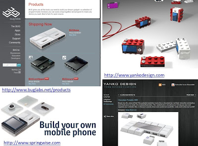
Over the last years there have been many ideas how to make devices more modular. Components that allow the end-user to create their own device – with exactly the functionality they want have been the central idea. So far they are only used in prototyping and have not really had success in the market place. The main reason seems that you get a device that has everything included and does everything – smaller and cheaper… But perhaps as electronics gets smaller and core functions get more mature it may happen.

Yanko Design has proposed a set of concepts along this line – and some of them are appealing 🙂
http://www.yankodesign.com/2007/12/12/chocolate-portable-hdd/
http://www.yankodesign.com/2007/11/26/blocky-mp3-player-oh-and-modular-too/
http://www.yankodesign.com/2007/08/31/it-was-a-rock-lobster/

Buglabs (http://www.buglabs.net) sells a functional system that allows you to build your own mobile device.

Being creative and designing your own system has been of interest in the computing and HCI community for many years. At last years CHI there was an paper by Buechley et al. [1] that looked how the LilyPad Arduino can make creating „computers“ an intersting experience – and especially for girls.

[1] Buechley, L., Eisenberg, M., Catchen, J., and Crockett, A. 2008. The LilyPad Arduino: using computational textiles to investigate engagement, aesthetics, and diversity in computer science education. In Proceeding of the Twenty-Sixth Annual SIGCHI Conference on Human Factors in Computing Systems (Florence, Italy, April 05 – 10, 2008). CHI ’08. ACM, New York, NY, 423-432. DOI= http://doi.acm.org/10.1145/1357054.1357123

Design Ideas and Demos at FH Potsdam

During the workshop last week in Potsdam we got to see demos from students of Design of Physical and Virtual Interfaces class taught by Reto Wettach and JennyLC Chowdhury. The students had to design a working prototype of an interactive system. As base technology most of them use the Arduino Board with some custom made extensions. For a set of pictures see my photo gallery and the photos on flickr. It would need pages to describe all of the projects so I picked few…

The project “Navel” (by Juan Avellanosa, Florian Schulz and Michael Härtel) is a belt with tactile output, similar to [1], [2] and [3]. The first idea along this lines that I have tried out was Gentle Guide [4] at mobile HCI 2003 – it seemed quite compelling. The student project proposed one novel application idea: to use it in sport. That is quite interesting and could complement ideas proposed in [5].

Vivien’s favorite was the vibrating doormat; a system where a foot mat is constructed of three vibrating tiles that can be controlled and different vibration patters can be presented. It was built by Lionel Michel and he has several ideas what research questions this could address. I found especially the question if and how one can induce feelings and emotions with such a system. In the same application context (doormat) another prototype looked at emotions, too. If you stroke or pat this mat it comes out of its hiding place (Roll-o-mat by Bastian Schulz).

There were several projects on giving everyday objects more personality (e.g. a Talking Trashbin by Gerd-Hinnerk Winck) and making them emotional reactive (e.g. lights that reacted to proximity). Firefly (by Marc Tiedemann) is one example how reactiveness and motion that is hard to predict can lead to an interesting user experience. The movement appears really similar to a real firefly.

Embedding Information has been an important topic in our research over the last years [6] – the demos provided several interesting examples: a cable that visualized energy consumption and keyboard to leave messages. I learned a further example of an idea/patent application where information is included in the object – in this case in a tea bag. This is an extreme case but I think looking into the future (and assuming that we get sustainable and bio-degradable electronics) it indicates an interesting direction and pushing the idea of Information at your fingertip (Bill Gates Keynote in 1994) much further than originally intended.

For more photos see my photo gallery and the photos on flickr.

[1] Tsukada, K. and Yasumrua, M.: ActiveBelt: Belt-type Wearable Tactile Display for Directional Navigation, Proceedings of UbiComp2004, Springer LNCS3205, pp.384-399 (2004).

[2] Alois Ferscha et al. Vibro-Tactile Space-Awareness . Video Paper, adjunct proceedings of Ubicomp2008. Paper. Video.

[3] Heuten, W., Henze, N., Boll, S., and Pielot, M. 2008. Tactile wayfinder: a non-visual support system for wayfinding. In Proceedings of the 5th Nordic Conference on Human-Computer interaction: Building Bridges (Lund, Sweden, October 20 – 22, 2008). NordiCHI ’08, vol. 358. ACM, New York, NY, 172-181. DOI= http://doi.acm.org/10.1145/1463160.1463179

[4] S.Bosman, B.Groenendaal, J.W.Findlater, T.Visser, M.de Graaf & P.Markopoulos . GentleGuide: An exploration of haptic output for indoors pedestrian guidance . Mobile HCI 2003.

[5] Mitchell Page, Andrew Vande Moere: Evaluating a Wearable Display Jersey for Augmenting Team Sports Awareness. Pervasive 2007. 91-108

[6] Albrecht Schmidt, Matthias Kranz, Paul Holleis. Embedded Information. UbiComp 2004, Workshop ‚Ubiquitous Display Environments‘, September 2004

What happens if Design meets Pervasive Computing?

This morning I met with Claudius Lazzeroni, a colleague from Folkwang Hochschule (they were part of our University till two years ago).
 
They have different study programs in design and art related subjects. He showed me some projects (http://www.shapingthings.net/ – in German but lots of pictures that give you the idea). Many of the ideas and prototypes related to our work and I hope we get some joint projects going. I think it could be really exciting to have projects with design and computer science students – looking forward to this!
When I was in the UK we collaborated in the equator project with designers – mainly Bill Gaver and his group – and the results were really exciting [1]. We build a table that reacted to load changes on the surfaces and allowed you to fly virtually over the UK. The paper is worthwhile to read – if you are in a hurry have a look at the movie about it on youtube: http://www.youtube.com/watch?v=uRKOypmDDBM
There was a further project with a table –  a key table – and for this one there more funny (and less serious?) video on youtube: http://www.youtube.com/watch?v=y6e_R5q-Uf4
[1] Gaver, W. W., Bowers, J., Boucher, A., Gellerson, H., Pennington, S., Schmidt, A., Steed, A., Villars, N., and Walker, B. 2004. The drift table: designing for ludic engagement. In CHI ’04 Extended Abstracts on Human Factors in Computing Systems (Vienna, Austria, April 24 – 29, 2004). CHI ’04. ACM, New York, NY, 885-900. DOI= http://doi.acm.org/10.1145/985921.985947