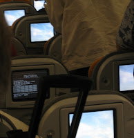
Flying back from Sydney with Qantas and now flying to Seattle with Lufthansa I had to long distance flights in which I had the opportunity to study (n=1, subject=me, plus over-shoulder-observation-while-walking-up-and-down-the-aisle 😉 the user interface for the in-flight entertainment.
The 2 systems have very different hardware and software designs. The Qantas infotainment system is a regular screen and interaction is done via a wired moveable remote control store in the armrest. The Lufthansa system uses a touch screen (It also has some hard buttons for volume in the armrest). Overall the content on the Qantas system comprised of more content (more movies, more TV-shows) including real games.
The Qantas system seemed very well engineered and the remote control UI worked was greatly suited for playing games. Nevertheless the basic operation (selecting movies etc.) seemed more difficult using the remote control compared to the touch screen interface. In contrast the Lufthansa system seems to have much room for improvement (button size, button arrangement, reactions times of the system) but it appeared very easy to use.
So here are my hypotheses:
Hypothesis 1: if you design (public) information or edutainment systems (excluding games) using a touch screen is a better choice than using an off-screen input device.
Hypothesis 2: with UI design team of a given ability (even a bad UI design team) you will create a significantly better information and edutainment systems (excluding games) if you use a touch screen than using an off-screen input device.
From the automotive domain we have some indications that good off-screen input device are really hard to design so that they work well (e.g. in-build-car navigation system). Probably I should find a student to proof it (with n much larger than 1 and other subjects than me).
 PS: the Lufthansa in-flight entertainment runs on Windows-CE 5.0 (the person in front of me had mainly the empty desktop with the Win CE logo showing) and it boots over network (takes over 6 minutes).