Merry Christmas 2016

Merry Christmas 2016


Look inside your envelope,

the Christmas card should have them all:

Wooden wheel, a snowflake, too.

Copper things, we have a few.

Resistor, light, they’re all brand new,

a paper cut out with a view.


To bring the gift of light,

for every winter night.

You will need the following pieces for the first assembly part:

four copper strips (two long, two short), LED, resistor, wooden rim, wooden plug and the black piece of paper.


Slide in the LED,

into the holes that be.

Long leg positioned through the oak,

on the left side of the thickest spoke.

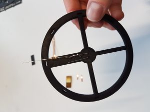
First, insert the LED into the two holes on the wooden rim. The longer leg of the LED goes into the left hole, when the thickest spoke points away from you.


Resistor needs to be installed,

‚cause, otherwise, it will explode.

Remember the longer diode leg,

it connects to the pole that adds (+).

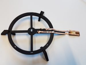
Bend the legs towards the other side of the spoke and attach the resistor to one of the legs. Make sure it is tightly connected. Remember the position of the longer leg for later on. 


Onto the wooden ring,

attach with copper string.

Wrap around the leggy bit,

the extra strings will make it fit.

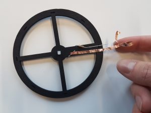
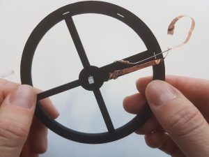
Now it is time to attach the copper strings to the rim. Carefully place the two longer copper strips on both sides of the thick spoke using the adhesive side. Twist it around the LED legs and use the short strips to fixate it. CAUTION: the adhesive side does not conduct electricity, so make sure the other side is attached to the LED legs.


The gluey side just won’t conduct,

hence wires must be nicely tucked.

Repeat the same step for the second leg. When finished, the result should look similar to the picture above.


Plus pole connects to long diode leg,

make sure this is correct.

Conductive strips for the plug,

need to be edge-snug.

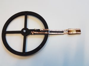
Connect the plug to the two stripes using the small piece of black paper to keep the strips separated. Make sure to connect the longer LED leg to the plus pole (marked on the plug). If you followed all steps up until now, you can simply connect it as shown above. The strips attached to the plug should be spaced as far apart as possible (on both side), but must not overlap over the ledge.


Attach the plug you just might,

and you have a working light.

You may want to test your Christmas lantern for now. Plug it into a USB-charger and check if the LED lights up. If not, check the wiring, especially the connection between LED legs and copper strips. Consider checking for correct polarity. Do not despair if your light does not work. You can still proceed and build the final lantern.


The lantern stands on wooden feet,

and then you join the paper sheets.

Be aware of text alignment,

else you prolong the assignment.

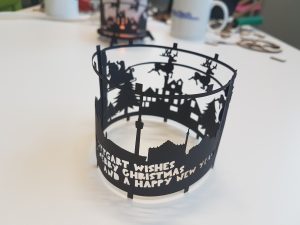
Now it is time to make it look like a lantern. Attach the feet to the wooden rim and connect the two paper ornaments. Check the text orientation before connecting both pieces. Be sure to insert the paper hooks as shown in the picture for a stable and round lantern.


And now it’s time to mount the screen,

it wraps around the wooden rim.

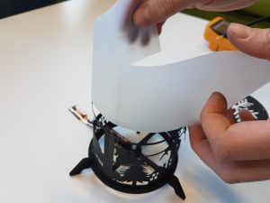
Slide the transparent paper into the lantern. For best visual results, position the fold in front of the overlap.


The snowflake goes on top,

ensure that room lights are now off.

Position the quadratic transparent paper on top of the lantern and add the snowflake ornament.


Now it’s time to plug it in,

and pour yourself a Christmas drink.


Highlights 2016!

Congratulations to our PhDs

This year we had 6 people finishing their PhD – the highest number for a single year till now – congratulations!


Exciting new Projects

In 2016 we started a number of new projects:


Event Highlight

Illusions 2.0, Talk at the Museum Ludwig in Köln

In Cologne in the Museum Ludwig I gave in the afternoon a talk on „Illusions 2.0 – embedded interactive media“ at the Forum Mediendesign. The talk focused on the new qualities of magical experiences we will be able to create with pervasive computing technologies in the future and linked this to Alan Kay’s notion of user illusion and metaphors. I looked at trends that are ingredience for creating Illusions 2.0 – in particular ubiquitous communication and display, constant tracking and logging, and the decrease of value of traditional content (text, audio, video, software, tv, statistical data). I highlighted one development that have already happened and has impacted our lives with the following statement. The question „If I only would know when the others come and where they are now…“ was common to people born before 1970 but is completely alien to people born after 2000. Mobile communication has changed this and tracking will add more change over the next years.

Based on some examples from recent popular fiction (Harry Potter) I showed that things that we have considered magical are becoming rapidly community products (e.g. marauders map). Spinning this idea forward I asked how far are we with regard to other human dreams such as looking into the future or never forgetting anything we have seen or heard. And the answer in short is: we are close 😉 for more see the slides of my talk on Illusion 2.0. There is an upcoming paper we wrote for IEEE Multimedia Magazine on this topic – will tell as soon as it is published 😉

In the morning I had some time for sightseeing and Vivien and I went to the chocolate museum. The museum is brilliant and I learned how the hollow chocolate santas are made 🙂 In the top floor they have a table top projection for a quiz – it is very well done (as the whole museum) but the technology did not work on the table close to the window. As we know from our experience if you have sun light your camera-projector systems may have trouble 😉
PS: it was interesting that the whole organization was done by students as a course in project management – and they did it really well.

Innovative in-car systems, Taking photos while driving

Wolfgang just sent me another picture (taken by a colleague of him) with more information in the head-up display. It shows a speed of 180 km/h and I wonder who took the picture. Usually only the driver can see such a display 😉

For assistance, information and entertainment systems in cars (an I assume we could consider taking photos an entertainment task) there are guidelines [1, 2, 3] – an overview presentation in German can be found in [4]. Students in the Pervasive Computing class have to look at them and design a new information/assistance system that is context aware – perhaps photography in the car could be a theme… I am already curious about the results of the exercise.

[1] The European Statement of Principles (ESoP) on Human Machine Interface in Automotive Systems
[2] AAM Guidelines
[3] JAMA Japanese Guidelines
[4] Andreas Weimper, Harman International Industries, Neue EU Regelungen für Safety und Driver Distraction

(thanks to Wolfgang Spießl for sending the references to me)

Birthday candles going electronic

What is a birthday cake without a candle? Sometimes it is hard to find a candle but having a creative team there is always a solution – less than 3 minutes away 😉 As always with new technologies – after deployments ideas for Version 2 (which will include much more functionality) emerge… An there was another business idea – interactive wedding cakes – perhaps we explore this later this year 😉

Is it easier to design for touch screens if you have poor UI designers?

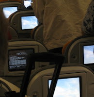
Flying back from Sydney with Qantas and now flying to Seattle with Lufthansa I had to long distance flights in which I had the opportunity to study (n=1, subject=me, plus over-shoulder-observation-while-walking-up-and-down-the-aisle 😉 the user interface for the in-flight entertainment.

The 2 systems have very different hardware and software designs. The Qantas infotainment system is a regular screen and interaction is done via a wired moveable remote control store in the armrest. The Lufthansa system uses a touch screen (It also has some hard buttons for volume in the armrest). Overall the content on the Qantas system comprised of more content (more movies, more TV-shows) including real games.

The Qantas system seemed very well engineered and the remote control UI worked was greatly suited for playing games. Nevertheless the basic operation (selecting movies etc.) seemed more difficult using the remote control compared to the touch screen interface. In contrast the Lufthansa system seems to have much room for improvement (button size, button arrangement, reactions times of the system) but it appeared very easy to use.

So here are my hypotheses:

Hypothesis 1: if you design (public) information or edutainment systems (excluding games) using a touch screen is a better choice than using an off-screen input device.

Hypothesis 2: with UI design team of a given ability (even a bad UI design team) you will create a significantly better information and edutainment systems (excluding games) if you use a touch screen than using an off-screen input device.

From the automotive domain we have some indications that good off-screen input device are really hard to design so that they work well (e.g. in-build-car navigation system). Probably I should find a student to proof it (with n much larger than 1 and other subjects than me).

PS: the Lufthansa in-flight entertainment runs on Windows-CE 5.0 (the person in front of me had mainly the empty desktop with the Win CE logo showing) and it boots over network (takes over 6 minutes).

Keynote at Pervasive 2008: Mark Billinghurst

Mark Billinghurst presented an interesting history of augmented reality and he showed clearly that camera phones are the platform to look out for. He reminded us that currently the 3D performance of mobile phones is similar to the most powerful 3D graphics cards show 15 years ago at SIGGRAPH. Looking back at Steven Feiner’s backpack [1] – the first augmented reality system I saw – can tell us that we should not be afraid to create prototypes that may be a bit clumsy if they allow us to create a certain user experience and for exploring technology challenges.

In an example video Mark showed how they have integrated sensor information (using particle computers) into an augmented reality application. Especially for sensor-network applications this seems to create interesting user interface options.

One reference on to robust outdoor tracking done at Cambridge University [2] outlines interestingly how combining different methods (in this case GPS, inertial, computer vision and models) can move location techniques forward. This example shows that high precision tracking on mobile devices may not be far in the future. For our application led research this is motivating and should push us to be more daring with what we assume from future location systems.

Mark argue to look more for the value of experience – the idea is basically that selling a user experience is of higher value than selling a service or a technology. This view is at the moment quite common – we have seen this argument a lot at CHI2008, too. What I liked with Mark’s argument very much is that he sees it in a layered approach! Experience is at the top of a set of layers – but you cannot sell experience without having technology or services and it seems a lot of people forget this. In short – no experience design if you do not have a technology working. This is important to understand. He included an example of interactive advertisement (http://www.reactrix.com/) which is interesting as it relates to some of the work we do on interactive advertisement (there will more as soon as we have published our Mensch und Computer 2008 paper).

His further example on experience was why you value a coffee at Starbucks at 3€ (because of the overall experience) reminded me of a book I recently read – quite a good airline/park read (probably only if you are not an economist) – makes the world a bit understandable [3].
Build enabling technologies and toolkits as means to improve one’s citation count was one of Mark’s recommendations. Looking back at our own work as well as the work of the Pervasive/Ubicomp community there is a lot of room for improvement – but it is really hard to do it …

[1] S. Feiner, B. MacIntyre, T. Höllerer, and T. Webster, A touring machine: Prototyping 3D mobile augmented reality systems for exploring the urban environment. Proc. ISWC ’97 (First IEEE Int. Symp. on Wearable Computers), October 13-14, 1997, Cambridge, MA. Also in Personal Technologies, 1(4), 1997, pp. 208-217, http://www1.cs.columbia.edu/graphics/publications/iswc97.pdf, http://www1.cs.columbia.edu/graphics/projects/mars/touring.html

[2] Reitmayr, G., and Drummond, T. 2006. Going out: Robust model-based tracking for outdoor augmented reality. In Proceedings of IEEE ISMAR’06, 109–118.http://mi.eng.cam.ac.uk/~gr281/docs/ReitmayrIsmar06GoingOut.pdf, http://mi.eng.cam.ac.uk/~gr281/outdoortracking.html

[3] Book: Tim Harford. The Undercover Economist. 2007. (German Version: Ökonomics: Warum die Reichen reich sind und die Armen arm und Sie nie einen günstigen Gebrauchtwagen bekommen. 2006.)

Visit at the TU Eindhoven

Elise van den Hoven, the program co-chair of TEI08, organized the printing of the proceeding. We went there on Tuesday to collect the books – quite a heavy load! The books look really good and the cover is great.

In the afternoon I gave a lecture with the title “Interacting with Pervasive Computing Systems”. I have related some of our recent work and ideas to the focus of the course which is “intelligent systems, products and related services”. In particular I asked to re-think how we can find a balance between user needs and technology push – without compromising a fruitful user centred design and development process. We continued this discussion with prof. Berry Eggen at dinner in a quite nice restaurant in town.

A further issue in my talk was to design interactive products and services that they fit their purpose very well – but that beyond this they allow for creative use. As an example I showed a set of photos I took with my phone. Some are in categories (e.g. preserving memory) that were probably anticipated by the designers whereas others (e.g. a WIFI-access code with I took a photo of not to have it to write down) are creative use. This observation again leads to the previous discussion on technology push and user need.

Being still new to the Ruhrgebiet and having not brush up on regional geography I was very much surprised how close Eindhoven is to Essen. Perhaps there is a chance for more collaboration in the future.

Reset/reboot is ubiquitous – or my worst train ride so far

What have learned to do when our computer or phone does not work anymore? Easy just reboot it. A colleague recently told me his rental car broke down (basically did not work anymore) but after resetting it, it worked fine again. When he told me I found this pretty strange – ok the radio or opening the car boot – but essential functions related to driving?

Today I was travelling on an ICE high-speed train to Amsterdam for the CHI-Notes committee meeting and shortly after we left Germany the train lost speed and became slower and just rolled out. Then can an interesting announcement: “Sorry it seems we do not get power anymore – but we think it is not a big problem. We reset the train and then we are on our way again”. The reboot did not work 🙁 so they told us we needed to another engine. Perhaps there was more to reboot (e.g. the train power grid nation wide?)…

Extrapolating in the future I can imagine a lot of things we will need to reboot, e.g. your shoes, your furniture, your house, your augmented sense, and your implants – or should we take more care in developing things?

At some point they decided we can not wait on the train and we had to get off the train outside the station (using small ladder) while it was pouring with rain. The left us than waiting for 2 hours (in the rain) – basically till we found ourselves another means of transport (overall delay about 5 hours). This made me realize that a Nokia N95 with GPS is probably really good while travelling – if I would have had it with me I could have called a taxi to where I was 😉

More about train rides… Some more traditional technologies however work very well – this week I was already once stuck on a train were a passenger pulled the emergency train and went of the train – somewhere in the middle of nowhere…

Article in the Economist

Some weeks ago Ben Sutherland from The Economist called. He was researching for an article discussing the computing revolution over the last 25 years. In his research he to talked to many different people (from different countries, different fields, different views) and was particularly interested in applications that will come in the future and with me in particular on the concept of context-awareness.

The article „The trouble with computers“ appeared 6th of September and discusses a mix of ideas and viewpoints. We talked about 30 minutes on the phone and I am quite surprised what statement he picked from me (I said many things that were more interesting ;-). However I think it is great that people start trying to understanding the radical changes computers introduce – everywhere.

Tico Ballagas defended his PhD in Aachen, New insight on Fitts‘ law.

Today I finally got around visiting Jan Borchers (media computing group at RWTH Aachen). Tico Ballagas hat as part of his PhD defence a public talk and took the chance to go there.

There where new parts in the talk on the impact of the selection space resolution on Fitts’s law that I had not seen in his work before. It is published in 2006 as a technical report (Rafael Ballagas and Jan Borchers. Selexels: a Conceptual Framework for Pointing Devices with Low Expressiveness. Technical Report AIB-2006-16, RWTH Aachen, Dec 2006) which is worthwhile to have a look at. This could be very interesting and relevant for the work Heiko Drewes does on eye-gaze interaction. Discriminating between input and output space for the index of difficulty could be helpful to understand better the impact of the errors that we see in eye gaze interaction.

One part of Tico’s research was concerned with a definition of a design space for input devices. This is partly described in a paper in IEEE Pervasive magazine, see: Ballagas, R., Borchers, J., Rohs, M., Sheridan, J.G., The Smart Phone: A Ubiquitous Input Device. IEEE Pervasive Computing 5(1). 70-77. 2006.