Rubber-like stretchable display

Jörg just sent me a link on a rubber-like stretchable display that is published in Nature Material. There is a previous press release with some photos [2]. This is a significant step towards new nteractive devices, such as the one suggested in the GUMMI project [3].

[1] Stretchable active-matrix organic light-emitting diode display using printable elastic conductors, Tsuyoshi Sekitani et al., Nature Materials, doi: 10.1038/nmat2459
http://www.nature.com/nmat/journal/vaop/ncurrent/abs/nmat2459.html

[2] http://www.ntech.t.u-tokyo.ac.jp/Archive/Archive_press_release/press_stretchable/documents/press_release_en.pdf

[3] Schwesig, C., Poupyrev, I., and Mori, E. 2004. Gummi: a bendable computer. In Proceedings of the SIGCHI Conference on Human Factors in Computing Systems (Vienna, Austria, April 24 – 29, 2004). CHI ’04. ACM, New York, NY, 263-270. DOI= http://doi.acm.org/10.1145/985692.985726

Offline Tangible User Interface

When shopping for a sofa I used an interesting tangible user interface – magnetic stickers. For each of the sofas systems the customer can create their own configuration using these magnetic stickers on a background (everything in a scale 1:50).

After the user is happy with the configuration the shop assistant makes a xerox copy (I said I do not need a black and white copy I make my own color copy with the phone) and calculates the price and writes up an order. The interaction with the pieces is very good and also great as a shared interface – much nicer than comparable systems that are screen based. I could imaging with a bit of effort one could create a phone application that scans the customer design, calculates the prices, and provides a rendered image of the configuration – with the chosen color (in our case green ;-). Could be an interesting student project…

Visit to Newcastle University, digital jewelry

I went to see Chris Kray at Culture Lab at Newcastle University. Over the next months we will be working on a joined project on a new approach to creating and building interactive appliances. I am looking forward to spending some more time in Newcastle.

Chris showed me around their lab and I was truly impressed. Besides many interesting prototypes in various domains I have not seen this number of different ideas and implementations of table top systems and user interface in another place. For picture of me in the lab trying out a special vehicle see Chris‘ blog.

Jayne Wallace showed me some of her digital jewelry. A few years back she wrote a very intersting article with the title „all the useless beauty“ [1] that provides an interesting perspective on design and suggests beauty as a material in digital design. The approach she takes it to design deliberately for a single individual. The design fits their personality and their context. She created a communication device to connect two people in a very simple and yet powerful way [2]. A further example is a piece of jewelry that makes the environment change to provide some personal information – technically it is similar to the work we have started with encoding interest in the Bluetooth friendly names of phones [3] but her artefacts are much more pretty and emotionally exciting.

[1] Wallace, J. and Press, M. (2004) All this useless beauty The Design Journal Volume 7 Issue 2 (PDF)

[2] Jayne Wallace. Journeys. Intergeneration Project.

[3] Kern, D., Harding, M., Storz, O., Davis, N., and Schmidt, A. 2008. Shaping how advertisers see me: user views on implicit and explicit profile capture. In CHI ’08 Extended Abstracts on Human Factors in Computing Systems (Florence, Italy, April 05 – 10, 2008). CHI ’08. ACM, New York, NY, 3363-3368. DOI= http://doi.acm.org/10.1145/1358628.1358858

Mobile Boarding Pass, the whole process matters

Yesterday night I did an online check-in for my flight from Düsseldorf to Manchester. For convenience and curiosity I chose the mobile boarding pass. It is amazingly easy and it worked in principle very well. Only not everyone can work without paper yet. At some point in the process (after border control) I got a hand written „boarding pass“ because this person needs to stamp it 😉 and we would probably have gotten into an argument if he tried to stamp my phone. There is some further room for improvement. The boarding pass shows besides the 2D barcode all the important information for the traveler – but you have to scroll to the bottom of the page to get the boarding number (which seems quite important for everyone else than the traveler – it was even on my handwritten boarding pass).

Final Presentation: Advertising 2.0

Last term we ran an interdisciplinary project with our MSc students from computer science and business studies to explore new ways in outdoor advertising. The course was jointly organized by the chairs: Specification of Software Systems, Pervasive Computing and User Interface Engineering, and Marketing and Trade. We were in particular interested what you can do with mobile phones and public displays. It is always surprising how much a group of 10 motivated students can create in 3 months. The group we had this term was extraordinary – over the last weeks they regularly stayed in the evenings longer in the lab than me 😉

The overall task was very open and the students created a concept and than implemented it – as a complete system including backend server, end user client on the mobile phone, and administration interface for advertisers. After the presentation and demos we really started thinking where we can deploy it and who the potential partners would be. The system offers means for implicit and explicit interaction, creates interest profiles, and allows to target adverts to groups with specific interest. Overall such technologies can make advertising more effective for companies (more precisely targeted adverts) and more pleasant for consumers (getting adverts that match personal areas of interest).

There are more photos of the presentation on the server.

PS: one small finding on the side – Bluetooth in its current form is a pain for interaction with public display… but luckily there are other options.

Modular device – for prototyping only?


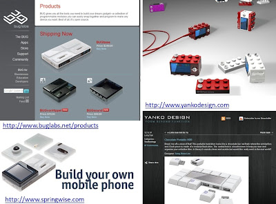
Over the last years there have been many ideas how to make devices more modular. Components that allow the end-user to create their own device – with exactly the functionality they want have been the central idea. So far they are only used in prototyping and have not really had success in the market place. The main reason seems that you get a device that has everything included and does everything – smaller and cheaper… But perhaps as electronics gets smaller and core functions get more mature it may happen.

Yanko Design has proposed a set of concepts along this line – and some of them are appealing 🙂
http://www.yankodesign.com/2007/12/12/chocolate-portable-hdd/
http://www.yankodesign.com/2007/11/26/blocky-mp3-player-oh-and-modular-too/
http://www.yankodesign.com/2007/08/31/it-was-a-rock-lobster/

Buglabs (http://www.buglabs.net) sells a functional system that allows you to build your own mobile device.

Being creative and designing your own system has been of interest in the computing and HCI community for many years. At last years CHI there was an paper by Buechley et al. [1] that looked how the LilyPad Arduino can make creating „computers“ an intersting experience – and especially for girls.

[1] Buechley, L., Eisenberg, M., Catchen, J., and Crockett, A. 2008. The LilyPad Arduino: using computational textiles to investigate engagement, aesthetics, and diversity in computer science education. In Proceeding of the Twenty-Sixth Annual SIGCHI Conference on Human Factors in Computing Systems (Florence, Italy, April 05 – 10, 2008). CHI ’08. ACM, New York, NY, 423-432. DOI= http://doi.acm.org/10.1145/1357054.1357123

Visit to Nokia Research Center Tampere, SMS, Physiological sensors

This trip was my first time in Tampere (nice to see sometimes a new place). After arriving yesterday night I got a quick cultural refresher course. I even met a person who was giving today a presentation to the president of Kazakhstan (and someone made a copy using a phone – hope he got back OK to Helsinki after the great time in the bar).

In the morning I met a number of people in Jonna Hakkila’s group at the Nokia Research Center. The team has a great mix of backgrounds and it was really interesting to discuss the project, ranging from new UI concepts to new hardware platform – just half a days is much too short… When Ari was recently visiting us in Essen he and Ali started to implement a small piece of software that (hopefull) improves the experience when receiving an SMS (to Ali/Ari – the TODOs for the Beta-release we identified are: sound design, screen design with statistics and the exit button in the menu, recognizing Ok and oK, autostart on reboot, volume level controlable and respecting silent mode). In case you have not helped us with our research yet please fill in the questionnaire: http://www.pcuie.uni-due.de/uieub/index.php?sid=74887#

I gave a talk (see separate post on the next big thing) and had the chance to meet Jari Kangas. We discovered some common interest in using physiological sensing in the user interface context. I think the next steps in integrating physiological sensors into devices are smaller than expected. My expectation is that we rather detect simple events like „surprise“ rather than complex emotion (at least in the very near future). We will see where it goes – perhaps we should put some more students on the topic…

Bob Iannucci from Nokia presents Keynote at HotMobile 2009

Bob Iannucci from Nokia presented his keynote „ubiquitous structured data: the cloud as a semantic platform“ at HotMobile 2009 in Santa Cruz. He started out with the statement that „Mobility is at the beginning“ and he argued that why mobile systems will get more and more important.

He presented several principles for mobile devices/systems

  • Simplicity and fitness for purpose are more important than feature
  • use concepts must remain constant – as few concepts as possible
  • presentations (what we see) and input modalities will evolve
  • standards will push the markets

Hearing this, especially the first point, from someone from Nokia seemed very interesting. His observations are in general well founded – especially the argument for simple usage models and sensible conceptual models when targeting the whole population of the earth as users.

In the keynote he offered an alternative conceptual model: Humans are Relational. Model everything as relations between people, things and places. He moved on to the question what are the central shortcomings in current mobile systems/mobile phones and he suggested it comes down to (1) no common data structure and (2) no common interaction concept.

With regard to interaction concepts he argued that a Noun-Verb style interaction is natural and easy for people to understand (have heard this before, for a discussion about it in [1, p59]). The basic idea in this mode is to choose a noun (e.g. people, place, thing) and then decide what to do with it (verb). From his point of view this interaction concept fits well the mobile device world. He argued that a social graph (basically relationships as in facebook etc.) would be well suited for a noun-verb style interaction. The nodes in the graph (e.g. people, photos, locations, etc.) are nouns and transformations (actions) between the nodes are the verbs. He suggested if we represent all the information that people have now in the phone as a graph and we have an open standard (and infrastructure) to share we could create a universal platform for mobile computing. (and potentially a huge graph with all the information in the world 😉

I liked his brief comment on privacy: „many privacy problems can be reduced to economic problems“. Basically people give their information away if there is value. And personally I think in most cases people give it away even for a minimal value… So far we have no market place where people can sell their information. He mentioned the example of a personal travel data which can provide the basis for traffic information (if aggregated). I think this is an interesting direction – how much value would have my motion pattern have?

Somehow related to what you can do on a mobile phone he shared with us the notion of the „3-Watt limit“. This seems fundamental: you cannot have more than 3 Watt used up in a device that fits in your hand (typical phone size) as otherwise it would get to hot. So the processing power limitation is not on the battery, but on the heat generated.

[1] Jef Raskin. The Humane Interface. Addison-Wesley. 2000.

New project on ambient visualization – kick-off meeting in Munich

We met in Munich at Docomo Euro Labs to start a new project that is related to context and ambient visualizations. And everyone already got bunnies 😉

Related to this there is a large and very interesting project: IYOUIT. Besides other things it can record and share your context – if you have a Nokia series 60 phone you should try it out. As far as I remember it was voted best mobile experience at mobile HCI 2008. 

Lucia and Thomas from Vodafone R&D visiting

Lucia Terrenghi and Thomas Lang from Vodafone R&D in Munich visited our lab. We talked at lot about the future role of mobile devices and in particular how they may change personal computing in the near future. 

After lunch they gave a talk for our students describing Vodafone research and their particular research interests. Using a nice visualization of train lines they showed the research themes and introduced some of their research foci. One area of interest is electronic paper, resulting future devices and potential applications and services. In the discussion I briefly mentioned that I had a look at some of the displays with my microscope – have a look in the previous blog post if you are interested.