Back in Korea, Adverts, Driving and Entertainment

On the way into town we got a really good price for the taxi (just make a mental note never to negotiate something with Florian and Alireza at the same time 😉 It seems taxi driving is sort of boring – he too watched television while driving (like the taxi driver some weeks ago in Amsterdam). I think we should seriously think more about entertainment for micro breaks because I still think it is for a good reason not allowed to watch TV while driving.

Seoul is an amazing place. There are many digital signs and electronic adverts. Walking back to the hotel I saw a large digital display on a rooftop (would guess about 10 meters by 6 meters). If working it is probably nice. But now it is mal functioning and the experience walking down the road is worsened as one inevitably looks at it. I wonder if in 10 years we will be used to broken large screen displays
   

Keynote at MobileHCI2008: BJ Fogg – mobile miracle

BJ Fogg gave the opening keynote at mobile HCI 2008 in Amsterdam. The talk explained very well the concept of Captology (computers as persuasive technologies) and the newer projects are very inspiring. He put the following questions at the center: How can machines change people’s minds and hearts? How can you automate persuasion? His current focus is on behavior change.

He reported of a class he is teaching at Stanford on designing facebook applications. The metric for success (and on this students are marked) is the uptake of the created application over the time of the course. He reported that the course attracted 16 million users in total and about 1 million on a daily basis – that is quite impressive. This is also an example of the approach he advocates: “rather try than think”. The rational is to try out a lot of things (in the real market with real users, alpha/beta culture) rather than optimize a single idea. Here the background is that nowadays implementation and distribution is really easy and that the marked decides if it is hot or not
 His advice is to create minimal application – simple application and then push it forward. All big players (e.g. google, flickr) have done it this ways


With regard to the distribution methods for persuasion he referred over and over to social networks (and in particular facebook). His argument is that by these means one is able to reach many people in a trusted way. He compared this to the introduction of radio but highlighted the additional qualities. Overall he feels that Web 2.0 is only a worm up for all the applications to come on the mobile in the future.

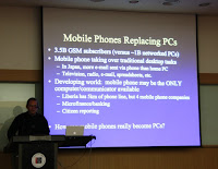
At the center of the talk was that prediction that mobile devices will be within 15 years the main technology for persuasion. He argued that mobile phones are the greatest invention of human kind – more important than the writing and transportation systems (e.g. planes, cars). He explained why mobile phones are so interesting based on three metaphors: heart, wrist watch, magic wand.

Heart – we love our mobile phones. He argued that if users do not have their phone with them they miss it and that this is true love. Users form a very close relationship with their phone and spend more time with the phone than with anything/anyone else. He used the image of “mobile marriage”


Wrist watch – the phone is always by our sides. It is part of the overall experience in the real world provding 3 functions: Concierge (reactive, can be asked for advice, relationship base on trust), Coach (proactive, coach comes to me tells me, pushing advice), and Court Jester (entertains us, be amused by it, create fun with content that persuades).

Magic wand – phones have amazing and magical capabilities. A phone provides humans with a lot of capabilities (remote communication, coordination, information access) that empower many things.

Given this very special relationship it may be a supplement for our decision making (or more general our brain). The phone will advise us what to do (e.g. navigation systems tell us where to go) and we love it. We may have this in other areas, too – getting told what movie to see, what food to eat, when to do exercise, 
 not fully convinced 😉

He gave a very interesting suggestion how to design good mobile applications. Basically to create a mobile application the steps are: (1) Identify the essence of the application, (2) strip everything of the application that is not essential to provide this and (3) you have a potentially compelling mobile application. Have heard of this before, nevertheless it seems that still features sell but it could by a change with the next generation.

He provided some background on the basics of persuasion. For achieving a certain target behavior you need 3 things – and all at the same time: 1. sufficient motivation (they need to want to do it), 2. Ability to do what they want (you either have to train them or to make it very easy – making easer is better) and 3. a trigger. After the session someone pointed out that this is similar to what you have in crime (means, motive, opportunity 😉

For creating persuasive technologies there are 3 central pairs describing motivation:

  • Instant pleasure and gratification vs. instant pain
  • Anticipation of good or hope vs. anticipation of the bad or fear (it is noted that hope is the most important motivator
  • Social acceptance vs. social rejection

When designing systems it is essential to go for simplicity. He named the following five factors that influence simplicity: (1) money, (2) physical effort, (3) brain cycles, (4) social deviation, and (5) non-routine. Antonio pointed out that this links to work of Gerd Gigerenzer at MPI work on intuitive intelligence.

[1] Gigerenzer, G. Gut feelings: The intelligence of the unconscious. New York: Viking Press.

Workshop on User Experience at Nokia

Together with Jonna Hakkila’s group (currently run by Jani Mantyjarvi) we had a two day workshop at Nokia in Oulu discussion the next big thing* 😉
* motto on the Nokia research centers web page

It seems that many people share the observation that emotions and culture play a more and more important role in the design of services and applications – even outside the research labs. One evening we looked for the Finnish experience
 (photo by Paul)

Overall the workshop showed again how many ideas can be created in a very short time – hopefully we can follow up some of them and create some new means for communication. We plan to meet again towards the end of the year in Essen.

PS: Kiss the phone – some take it literarily: http://tech.uk.msn.com/news/article.aspx?cp-documentid=7770403

PPS: we talked about unanticipated use (some call it misuse) of technology, e.g. using the camera on the phone to take a picture of the inside of your fridge instead of writing a shopping list. Alternative uses is not restricted to mobile phones – see for yourself what you dishwasher may be good for…. http://www.salon.com/nov96/salmon961118.html

HCI Doctoral Consortium at VTT Oulu

Jonna Hakkila (Nokia), Jani Mantyjarvi (Nokia & VTT), and I discussed last year how we can improve the doctoral studies of our students and we decided to organize a small workshop to discuss PhD topics.

As Jonna is currently on maternity leave and officially not working we ran the workshop at VTT in Oulu.

The topics varied widely from basic user experience to user interface related security. There was very interesting work the participants did and published. I have selected the following 2 as reading suggestions: [1] by Elina Vartiainen and [2] by Anne Kaikkonen.

We hope we gave some advise – can resist to repeat the most important thing to remember:

  • a PhD thesis is not require to solve all problems in a domain
  • doing a PhD is yet another exam – not more and not less
  • finding/inventing/unterstanding something that makes a real difference to even a small part of the world is a great achievement (an not common in most PhD research)
  • do not start with thinking hard – start with doing your research

A good discussion on doing a PhD in computer science by Jakob Bardram can be found at [3].

[1] Roto, V., Popescu, A., Koivisto, A., and Vartiainen, E. 2006. Minimap: a web page visualization method for mobile phones. In Proceedings of the SIGCHI Conference on Human Factors in Computing Systems (MontrĂ©al, QuĂ©bec, Canada, April 22 – 27, 2006). CHI ’06. ACM, New York, NY, 35-44. DOI= http://doi.acm.org/10.1145/1124772.1124779

[2] Lehikoinen, J. T. and Kaikkonen, A. 2006. PePe field study: constructing meanings for locations in the context of mobile presence. In Proceedings of the 8th Conference on Human-Computer interaction with Mobile Devices and Services (Helsinki, Finland, September 12 – 15, 2006). MobileHCI ’06, vol. 159. ACM, New York, NY, 53-60. DOI= http://doi.acm.org/10.1145/1152215.1152228

[3] http://www.itu.dk/people/bardram/pmwiki/pmwiki.php?n=Main.ArtPhD

Trip to North Korea

[see the whole set of photos from tour to North Korea]

From Gwangju we took the bus shortly after midnight to go for a trip to North Korea. The students did a great job in organizing ISUVR and the trip. It was great to have again some time to talk to Yoosoo Oh, who was a visiting researcher in Munich in our group.

When entering North Korea there are many rules, including that you are not allowed to take cameras with tele-lenses over 160mm (so I had to take only the 50mm lens) and you must not bring mobile phones and mp3 players with you. Currently cameras, phones and MP3 players are visible with the human eye and to detect in an x-ray. But it does not take much imagination to see in a few years extremely small devices that are close to impossible to spot. I wonder how this will change such security precautions and whether or not I will in 10 years still possible to isolate a country from access to information. I doubt it


The sightseeing was magnificent – see the photos of the tour for yourself. We went onto the Kaesong tour (see http://www.ikaesong.com/ – in Korea only) It is hard to tell how much of the real North Korea we really saw. And the photos only reflect a positive selection of motives (leaving out soldiers, people in town, ordinary buildings, etc. as it is explicitly forbidden to take photos of those). I was really surprise when leaving the country they check ALL the pictures you took (in my case it took a little longer as it was 350 photos).

The towns and villages are completely different from what I have seen so far. No cars (besides police/emergency services/army/tourist busses) – but many people in the street walking or cycling. There were some buses in a yard but I have not seen public transport in operation. It seemed the convoy of 14 tourist buses is an attraction to the local people


I have learned that the first metal movable type is from Korea – about 200 years before Gutenberg. Such a metal type is exhibited in North Korea and in the display is a magnifying glass in front of the letter – pretty hard to take a picture of


ISUVR 2008, program day2

Norbert Streitz – Trade-off for creating smartness

Norbert gave an interesting overview of research in the domain of ubicomp based on his personal experience – from Xerox PARC to the disappearing computer. He motivated the transition from Information Design to Experience Design. Throughout the work we see a trade-off between providing “smart support” to the user and “privacy” (or control over privacy). One of the questions if we will re-invent privacy or if it will become a commodity

As one of the concrete examples Norbert introduced the Hello.Wall done in the context Ambient Agoras [1]. This again brought up the discussion of public vs. private with regard to the patterns that are displays. (photos of some slides from Norbert’s talk)

[1] Prante, T., Stenzel, R., Röcker, C., Streitz, N., and Magerkurth, C. 2004. Ambient agoras: InfoRiver, SIAM, Hello.Wall. In CHI ’04 Extended Abstracts on Human Factors in Computing Systems (Vienna, Austria, April 24 – 29, 2004). CHI ’04. ACM, New York, NY, 763-764. DOI= http://doi.acm.org/10.1145/985921.985924 (Video Hello.Wall)
Albrecht Schmidt – Magic Beyond the Screen
I gave a talk on “Human Interaction in Ubicomp -Magic beyond the screen” highlighting work in user interfaces beyond the screen that we did over the last years. It is motivated by the facts that classical limitations in computer science (e.g. frame rate, processing, storage) are getting less and less important to many application areas and that the human computer interaction becomes in many areas the critical part of the system.
In my talk I suggested using “user illusion” as a design tool for user interfaces beyond the desktop. This involves two steps: 1) describe precisely the user illusion the application will create and the 2) Investigate what parameters have an influence on the quality of the created user illusion for the application. (photos of some slides from Albrecht’s talk, Slides in PDF)
Jonathan Gratch – Agents with Emotions

His talk focused on the domain of virtual reality with a focus on learning/training applications. One central thing I learned is that the timing of non-verbal cues (e.g. nodding) is very crucial to produce an engagement in speaking with an agent. This may also be interesting for other forms of computer created feedback.
He gave a specific example on how assigning blame works. It was really interesting to see that there are solid theories in this domain that can be concretely used to design novel interfaces. He argues that appraisal theory can explain people’s emotional states and this could improve context-awareness.

He showed an example of emotional dynamics and it is amazing how fast emotion happen. One of the ways of explaining this is to look at different dynamics: dynamics in the world, dynamics in the perceived world relationship, and dynamic through action. (photos of some slides from Jonathan’s talk)
Daijin Kim – Vision based human robot interaction
Motivated by the vision that after the personal computer we will see the “Personal Robot” Daijin investigates natural ways to interact with robots. For vision based interaction with robots he named a set of difficulties, in particular: people are moving, robots are moving, and the illuminations and distances are variable. The proposed approach is to generate a pose, expression, and illumination specific active appearance model.
He argues that face detection is a basic requirement for vision based human robot interaction. The examples he showed in demo movie were very robust with regard to movement, rotation, and expression and it works for very variable distances. The talk contained further examples of fast face recognition and recognition of simple head gestures. Related to our research it seems that such algorithms could be really interesting in creating context-aware outdoor advertisement. (photos of some slides from Daijin’s talk)

Steven Feiner – AR for prototyping UIs

Steven showed some work mobile projector and mobile device interaction, were they used augmented reality for prototyping different interaction methods. He introduced Spot-light (position based interaction), orientation based interaction and widget-based interaction for an arm mounted projector. Using the synaptic touchpad and projection may also be an option for our car-ui related research. For interaction with a wrist device (e.g. a watch) he introduced the string-based interaction which is a simple but exciting idea. You pull out a string of a device and the distances as well as the direction are the resulting input parameters [2].
In a further example Steven showed a project that supports field work on identification of plants using capture (of the image of the real leaf), comparison with the data base and matching out of a subset that matches the features. Their prototype was done on a tablet and he showed ideas how to improve this with AR; it is very clear that this may also an interesting application (for the general user) on the mobile phone.

New interfaces and in particular gestures are hard to explore – if you have no idea what is supported by the system. In his example on visual hint for tangible gestures using AR Steven showed interesting options in this domain. One approach follows a “preview style” visualizations – they called it ghosting. (photos of some slides from Stevens’s talk)

[2] Blasko, G., Narayanaswami, C., and Feiner, S. 2006. Prototyping retractable string-based interaction techniques for dual-display mobile devices. In Proceedings of the SIGCHI Conference on Human Factors in Computing Systems (MontrĂ©al, QuĂ©bec, Canada, April 22 – 27, 2006). R. Grinter, T. Rodden, P. Aoki, E. Cutrell, R. Jeffries, and G. Olson, Eds. CHI ’06. ACM, New York, NY, 369-372. DOI= http://doi.acm.org/10.1145/1124772.1124827
[3] White, S., Lister, L., and Feiner, S.Visual Hints for Tangible Gestures in Augmented Reality.Proc. ISMAR 2007 IEEE and ACM Int. Symp. on Mixed and Augmented Reality, Nara Japan, November 13-16, 2007. (youtube video)

If you are curious about the best papers, please the photos from the closing 🙂

Finally some random things to remember:

  • Richard W. DeVaul did some work on subliminal user interfaces – working towwrds the vision of zero attention UIs [4]
  • Jacqueline Nadel (development psychologist) did studies on emotions between parents and infants using video conferencing
  • V2 – Toward a Universal Remote Console Standard http://myurc.org/whitepaper.php
  • iCat and Gaze [5]

[4] Richard W. DeVaul. The Memory Glasses: Wearable Computing for Just-in-Time Memory Support. PhD Thesis. MIT 2004. http://devaul.net/~rich/DeVaulDissertation.pdf

[5] Poel, M., Breemen, A.v., Nijholt, A., Heylen, D.K., & Meulemans, M. (2007). Gaze behavior, believability, likability and the iCat. Proceedings Sixth Workshop on Social Intelligence Design: CTIT Workshop Proceedings Series (pp. 109–124). http://www.vf.utwente.nl/~anijholt/artikelen/sid2007-1.pdf

ISUVR 2008, program day1

The first day of the symposium was exciting and we saw a wide range of contributions from context-awareness to machine vision. In following I have a few random notes on some of the talks


Thad Starner, new idea on BCI
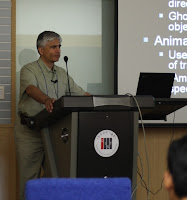
Thad Starner gave a short history of his experience with wearable computing. He argued that common mobile keyboards (e.g. mini-querty, multi-tap, T9) are fundamentally not suited real mobile tasks. He showed the studies of typing with the twiddler – the data is impressive. He is arguing for cording keyboards and generally he suggests that “Typing while walking is easier than reading while walking“ . I buy the statement but I still think that the cognitive load created by the twiddler does not make it generally suited. He also showed a very practical idea of how errors on mini-keyboards can be reduced using text prediction [1] – that relates to the last exercise we did in the UIE class. (photos of some slides from Thad’s talk)

He has suggested a very interesting approach to “speech recognition” using EEG. The basic idea is that people use sign language (either really moving their hands or just imagine to move their hands) and that the signals of the motor cortex are measured using a brain interface. This is so far the most convincing idea for a human computer brain interface idea that I have seen
 I am really curious to see Thad’s results of the study! He also suggested an interesting idea for sensors – using a similar approach as in hair replacement technology (have no idea about this so far, but I probably should read up on this).

[1] Clawson, J., Lyons, K., Rudnick, A., Iannucci, R. A., and Starner, T. 2008. Automatic whiteout++: correcting mini-QWERTY typing errors using keypress timing. In Proceeding of the Twenty-Sixth Annual SIGCHI Conference on Human Factors in Computing Systems (Florence, Italy, April 05 – 10, 2008). CHI ’08. ACM, New York, NY, 573-582. DOI= http://doi.acm.org/10.1145/1357054.1357147

Anind Dey – intelligible context
Anind provided an introduction to Context-Awareness. The characterized them as situationally appropriate applications that adapt to context and eventually increase the value to user. Throughout the talk he made a number of convincing cases that context has to be intelligible to the users, otherwise problems arise when the systems guess wrong (and they will get it wrong sometimes).

He showed an interesting example how data collected from a community of drivers (in this case cab drivers) is useful to predict the destination and the route. These examples are very interesting and show a great potential for learning and context prediction from community activity. I think sharing information beyond location may have many new applications.
In one study they use a windscreen project display (probably a HUD – have to follow up on this) We should find more about it as we look in such displays ourselves for one of the ongoing master projects. (photos of some slides from Aninds’s talk)

Vincent Lepetit – object recognition is the key for tracking
Currently most work in computer vision used physical sensors or visual markers. The vision however is real clear – just do the tracking based on natural features. In his talk he gave an overview how close we are to this vision. He showed examples of markerless visual tracking based on natural features. One is a book – which really looks like a book with normal content and no markers – which has an animated overlay.
His take-away message was “object recognition is the key for tracking” and it is still difficult. (photos of some slides from Vincent’s talk)

Jun Park – bridge the tangibility gap
In his talk he discussed the tangibility gap in design – in different stages of the design and the design evaluation it is important to feel the product. He argues that rapid prototyping, using 3D printing, is not well suited, especially as it is comparably slow and it is very difficult to render material properties. His approach alternative is augmented foam using a visually non-realistic but tangible foam mock-up combined with augmented reality techniques. Basically the CAD model is rendered on top of the foam.

The second part of the talk was concerned with e-commerce. The basic idea is that users can overlay a product into their own environment, to experience the size and how well it matches the place. (photos of some slides from Jun’s talk)

Paper Session 1 & 2

For the paper sessions see the program and some photos from the slides.
photos of some slides from paper session 1
photos of some slides from paper session 2

GIST, Gwangju, Korea

Yesterday I arrived in Gwangju for the ISUVR-2008. It is my first time in Korea and it is an amazing place. Together with some of the other invited speakers and PhD students we went for a Korean style dinner (photos from the dinner). The campus (photos from the campus) is large and very new.

This morning we had the opportunity to see several demos from Woontack’s students in the U-VR lab. There is a lot of work on haptics and mobile augmented reality going on. See the pictures of the open lab demo for yourself


In the afternoon we had some time for culture and sightseeing – the country side parks are very different from Europe. Here are some of the photos of the trip around Gwangju and see http://www.damyang.go.kr/

In 2005 Yoosoo Oh, a PhD student with Woontack Wo at GIST, was a visiting student in our lab in Munich. We worked together on issues related to context awareness and published a paper together discussing the whole design cycle and in particular the evaluation (based on a heuristic approach) of context-aware systems [1].

[1] Yoosoo Oh, Albrecht Schmidt, Woontack Woo: Designing, Developing, and Evaluating Context-Aware Systems. MUE 2007: 1158-1163

Photos – ISUVR2008 – GIST – Korea

Invited Lecture at CDTM, how fast do you walk?

Today I was at CDTM in Munich (http://www.cdtm.de/) to give a lecture to introduce Pervasive Computing. It was a great pleasure that I was invited again after last year’s visit. We discussed no less than how new computing technologies are going to change our lives and how we as developers are going to shape parts of the future. As everyone is aware there are significant challenges ahead – one is personal travel and I invited students to join our summer factory (basically setting up a company / team to create a news mobility platform). If you are interested, too drop me a mail.

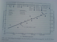
Over lunch I met with Heiko to discuss the progress of his thesis and fishing for new topics as they often come up when writing 😉 To motivate some parts of his work he looked at behavioral research that describes how people use their eyes in communication. In [1] interesting aspects of human behavior are described and explained. I liked the page (251) with the graphs on walking speed as a function of the size of city (the bigger the city the faster people walk – it includes an interesting discussion what this effect is based on) and the eye contacts made dependent on gender and size of town. This can provide insight for some projects we are working on. Many of the results are not surprising – but it is often difficult to pinpoint the reference (at least for a computer science person), so this book may be helpful.

[1] IrenÀus Eibl-Eibesfeldt. Die Biologie des menschlichen Verhaltens: Grundriss der Humanethologie. Blank; Auflage: 5. A. Dezember 2004.

Is it easier to design for touch screens if you have poor UI designers?

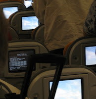
Flying back from Sydney with Qantas and now flying to Seattle with Lufthansa I had to long distance flights in which I had the opportunity to study (n=1, subject=me, plus over-shoulder-observation-while-walking-up-and-down-the-aisle 😉 the user interface for the in-flight entertainment.

The 2 systems have very different hardware and software designs. The Qantas infotainment system is a regular screen and interaction is done via a wired moveable remote control store in the armrest. The Lufthansa system uses a touch screen (It also has some hard buttons for volume in the armrest). Overall the content on the Qantas system comprised of more content (more movies, more TV-shows) including real games.

The Qantas system seemed very well engineered and the remote control UI worked was greatly suited for playing games. Nevertheless the basic operation (selecting movies etc.) seemed more difficult using the remote control compared to the touch screen interface. In contrast the Lufthansa system seems to have much room for improvement (button size, button arrangement, reactions times of the system) but it appeared very easy to use.

So here are my hypotheses:

Hypothesis 1: if you design (public) information or edutainment systems (excluding games) using a touch screen is a better choice than using an off-screen input device.

Hypothesis 2: with UI design team of a given ability (even a bad UI design team) you will create a significantly better information and edutainment systems (excluding games) if you use a touch screen than using an off-screen input device.

From the automotive domain we have some indications that good off-screen input device are really hard to design so that they work well (e.g. in-build-car navigation system). Probably I should find a student to proof it (with n much larger than 1 and other subjects than me).

PS: the Lufthansa in-flight entertainment runs on Windows-CE 5.0 (the person in front of me had mainly the empty desktop with the Win CE logo showing) and it boots over network (takes over 6 minutes).